How to Judge a Photography-Led Account, Not Just the Photos
You open an agency’s portfolio and the photography is beautiful. Twenty seconds later you have an opinion you cannot defend, because the only sentence available is “these are nice photos.” The real question is whether anyone directed this work, or whether a good photographer was left alone with a mood reference.
Why photography-led accounts get judged by eye instead of craft
Video gives you seams to inspect: a cut that lands a beat early, music chosen after the fact. Video craft has its own checklists, the editing decisions and the sound decisions, and neither transfers to a still. No timeline, no cut points, no track to mute. A photograph arrives whole and refuses to explain itself.
So reviewers fall back on taste. “I like these photos” reacts to one image. “This account was directed” is a different claim: someone made choices before the shutter fired, then made them again on another day with another subject. The tells live in what repeats, so the feed is the unit of assessment, not the picture, the same inference problem as reading intent from the output alone.
Composition consistency across a shoot, not within a single frame
Picture a skincare brand’s feed. Post one is a bottle at chest height, slightly above centre, top third of the frame empty. Post four is a different bottle, same height, same tilt, same empty top third. Post nine is a jar in the same place. Nobody hits the same crop distance three times by instinct. Someone decided where the camera goes, and the empty top third is held for a text overlay or product isolation.
The failure version: close in one post, distant in another, below the horizon in a third, negative space wandering to whichever side had less clutter. That is coverage, not direction. Coverage shoots many angles and picks the best frame later. Over four or five posts it can look deliberate, since photographers have habits. Push to ten and they separate: a system holds, a habit drifts.
Color discipline versus a filter applied afterward
Color is where the shortcut hides: one grade over everything makes a mismatched set look like a set. Three checks pull them apart.
- Does temperature hold as the subject changes? If warmth holds across a wooden table, a white studio wall and an outdoor shot at a different hour, someone controlled the lighting or chose sets that agree. Uniformity that shows only under a heavy wash is paint over three rooms.
- Read the shadows and highlights. Directed lighting keeps texture in both, so you still see weave in dark fabric and detail on a bright surface. A filter covering inconsistent exposure clips highlights to white or crushes shadows to black, which removes the evidence.
- Check the palette where nothing was graded. A brand going for muted sage and bone should show it in the product surface, the real background, the skin tones. If the palette lives only in the grade, the look was applied to the shoot, not built into it.
Art directed versus simply selected: reading the evidence of a brief
A directed shoot leaves fingerprints of the plan. The same linen backdrop turns up in posts two, six and eleven, chosen as a set. A prop reappears with a job, a ceramic dish always at the same distance from the lens. Locations repeat as considered environments, not as whatever was available that afternoon. Those are the results of a document that existed before anyone arrived.
Selected-not-directed reads differently. Posts obviously shot in one session carry different lighting setups, hard shadow in one and diffuse in the next. Backgrounds vary in ways no plan would produce. Most telling, the two or three strong images are outliers surrounded by weaker work rather than the norm. Direction raises the floor. A good eye without direction raises the ceiling and leaves the floor alone, close to the question of how much of the work the agency actually did.
Sequencing and grid logic: does the feed function as a designed system
Read the grid as one composition. A designed grid alternates shot types on purpose, tight detail, wide environment, tight detail. Color blocking, a dominant tone recurring at a set interval, is stronger still: it only happens if someone planned the order.
The alternative is pure chronology, a record of the calendar. Check this at grid level and nowhere else. One excellent photograph says nothing about whether the images either side of it were considered, part of what a portfolio leaves out.
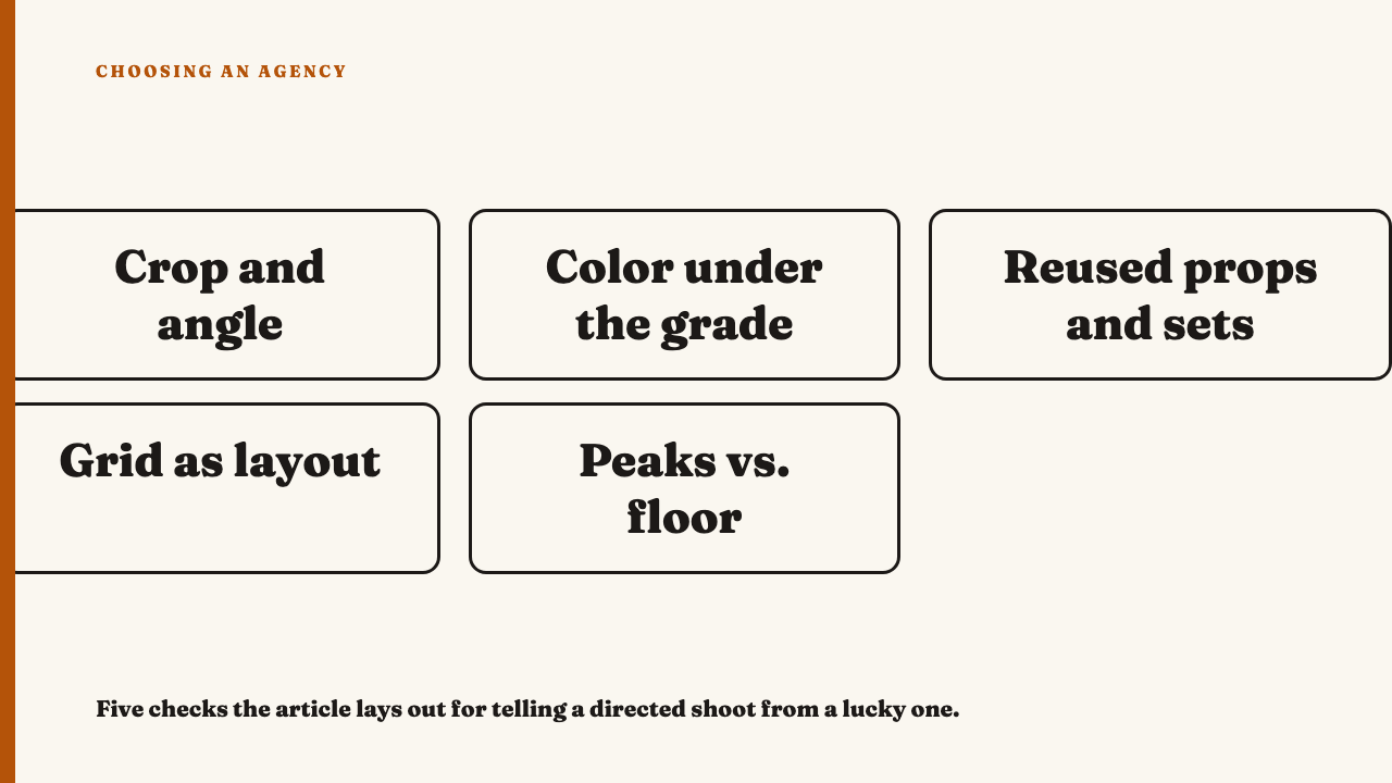
A five-minute checklist for a photography-led profile
- Scroll ten posts, not the top row, and check whether crop distance and angle repeat within each category.
- Test whether light discipline survives in the ungraded parts: real surfaces, skin tones, shadow detail.
- Find the props, sets or locations that reappear, and ask whether the reuse looks decided or coincidental.
- Read the grid as a layout: alternating shot types, planned color blocking, or plain chronology.
- Decide whether the strongest images are the standard or rare peaks surrounded by weaker work.
Where this stops: one shoot’s direction is not a brand’s whole system
All of this measures direction quality inside one shoot or one campaign’s worth of photography. Whether an agency holds that discipline across many months and many shoots is a harder question this site addresses separately. One tightly directed campaign is not proof of a durable visual system.
Bring us work worth looking at
To see these reads applied to real accounts, see this year’s selections, chosen editorially with the reasoning written out. If a team’s photography holds up under these checks, nominate an agency.
FAQ
What is the difference between a good photographer and good art direction on an account?
A good photographer produces one or two excellent frames from talent alone. Art direction makes choices repeat on purpose across dozens of posts, so consistency across a body of work is the tell, not the quality of any single image.
Is a strong color filter a sign of good direction?
Not on its own. A filter can be applied after the fact to paper over inconsistent lighting. Real color discipline shows underneath the grade, in retained shadow and highlight detail and in how product surfaces and skin tones actually sit.
Sources
All links below verified 2026-09-06.