Your Platform Habits Are Grading the Work Before You Do
Two pieces from the same agency are open in front of you. One is a vertical video shot on a phone, blown out, cut with a jump that feels careless. The other is a multi slide image set with a disciplined type system. Forty seconds in you know which is stronger, and the platform you scroll most made that call.
The bias has a mechanism, not just a symptom
Fluency with a format’s visual grammar makes intent visible: having seen thousands of examples, you carry a model of what its choices look like, so a departure reads as a decision. Remove the fluency and the same choice reads as an accident. An unfamiliar cut rhythm feels like bad editing, unfamiliar framing like a shaky hand. The work has not changed. Your ability to tell intent from error has. Psychology calls this the mere exposure effect, a tendency to like what is familiar. So the video, doing the harder and more native work, rates lower because you cannot read what in it was chosen.
What considered roughness actually looks like on screen
Picture a short video for a small food business, shot in the kitchen during service. A cut lands a beat late, sitting on a face a half second too long. The framing is handheld and moving, but across four cuts the subject sits in the same third of the frame. A fryer runs under the dialogue because the noise is telling you the room is busy.
The version that only looks similar: framing drifts because nobody watched the monitor, a cut lands late because nobody timed it, audio clips on the loudest word and stays clipped.
The difference is not the roughness. It is whether the rough choice repeats on purpose or varies at random. Deliberate lag has a rhythm you can count, and framing that keeps returning to the same third was operated by someone who knew where the subject belonged, while framing that lands somewhere new every cut was not operated at all. It is the inward-facing version of telling platform-native work from a crossposted asset.
Polish can be a format decision or a hiding place
Heavy production is not automatically stronger, and in a format whose grammar rewards texture it can be a mismatch. A piece graded and sound designed in a suite, dropped into a feed where everything looks made that morning, shows only that nobody asked what the format wanted. The same finish can be earned, because some formats call for control.
The test: strip the finish in your head and describe what is left in one plain sentence. If it is still interesting, the polish served an idea. If it is “a person uses the product and looks happy,” the finish was doing the concept’s work. It is one narrow application of what actually separates good social work from average.
Read the grammar the piece was actually built for
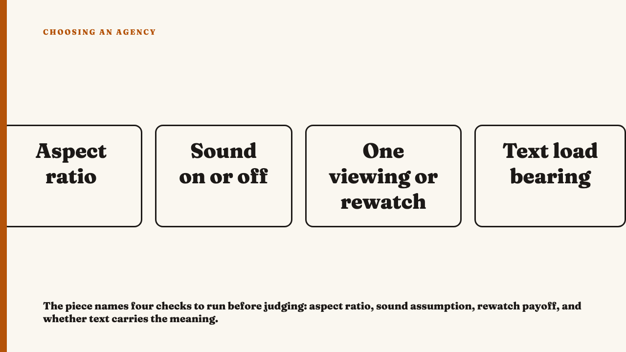
Before any quality judgment, establish which format’s conventions the piece is speaking in.
- Aspect ratio and how it is used. Filled edge to edge with the subject at the limits, or a square frame with breathing room?
- Whether pacing assumes sound on or sound off. If a beat only lands when you hear it, the piece was built for a viewer with audio.
- Whether it assumes one viewing or a rewatch. A detail that only pays off the second time was made for a viewer expected to scroll back.
- Whether text on screen is load-bearing or decorative. Remove it mentally. If the piece stops making sense, the text is carrying it.
The point is to name one rulebook before you judge, not to score the piece against every format at once.
The swap test: judge it on the platform it was made for
Run the checklist on the video. Full bleed vertical, subject at the edges, beats carried visually, a detail in the third shot that only registers on a second pass. That is short-form vertical grammar, and the piece executes it well: it holds without sound and rewards the rewatch.
Now the image set. Square frames, the viewer setting the pace by swiping, text load-bearing on every slide. That is multi slide grammar, and it asks a different question: does each slide earn the swipe, or do slides three through six repeat slide two in new typography? Often it is the weaker piece: five slides saying one thing is a design exercise.
The habit: before rating anything, say out loud which conventions the piece is following, then ask whether it executes them well. Skip that step and your scrolling habit grades for you.
Why this matters more once you’re comparing across an agency’s whole portfolio
On one piece this is a small error. Across a portfolio it compounds. An agency doing strong native work in a format you do not use scores lower every time that work appears, so the bias stacks instead of cancelling out and quietly rewards agencies whose output matches your scrolling habits. Work you cannot parse also looks inconsistent when you are reading strategy from what an agency actually posted, and that scatter is often in the evaluator, not the portfolio.
Correcting for this removes your blind spot. It does not upgrade weak work, which stays weak once you have named its grammar.
Put it to work
To see the standard applied rather than described, the current selections are here. If you know an agency whose best work lives in a format most evaluators skim past, nominate an agency.
FAQ
Is raw or low-fi content always better craft than polished content?
No, and assuming so is the same bias in reverse. Rough work made without intent is careless, and polished work in a format that calls for control is exactly right. Match the standard to the grammar the piece was built for.
How do I judge work on a platform I personally never use?
Name that format’s conventions first: aspect ratio, whether pacing assumes sound on or sound off, whether it expects one viewing or a rewatch, and whether text is load-bearing. Only then judge execution, against those conventions rather than the ones you scroll most.
Does this mean every agency needs to be equally good on every format?
No. This is about evaluating each piece on its own terms, not demanding uniform output everywhere. A portfolio can be strongest in one place, and that strength should not be penalised because you are unfamiliar with the format.
Sources
- Mere-exposure effect, Wikipedia, fetched 7 September 2026.