Judging How a Brand Frames a Difficult Subject
A brand posts about bereavement, or burnout, and something is off. The writing is fine and the subject is real, yet you flinch and cannot say why. If you are judging an agency’s work on serious subjects, that flinch is useful once you can turn it into a reading.
The feeling that arrives before the analysis
Picture a brand that sells something ordinary and posts about losing a parent. The caption is thoughtful. But the cover is a pastel gradient with a sparkle emoji in the first line, or a long grave preamble sits in front of one mild sentence. The problem happened before you reached the content.
Framing is the set of choices made before the viewer reaches the content itself, and it can be judged on its own. It differs from caption and copy craft, where a voice is free to express itself. Here, tone is calibrated under constraint, and the skill is holding the voice back to the right level.
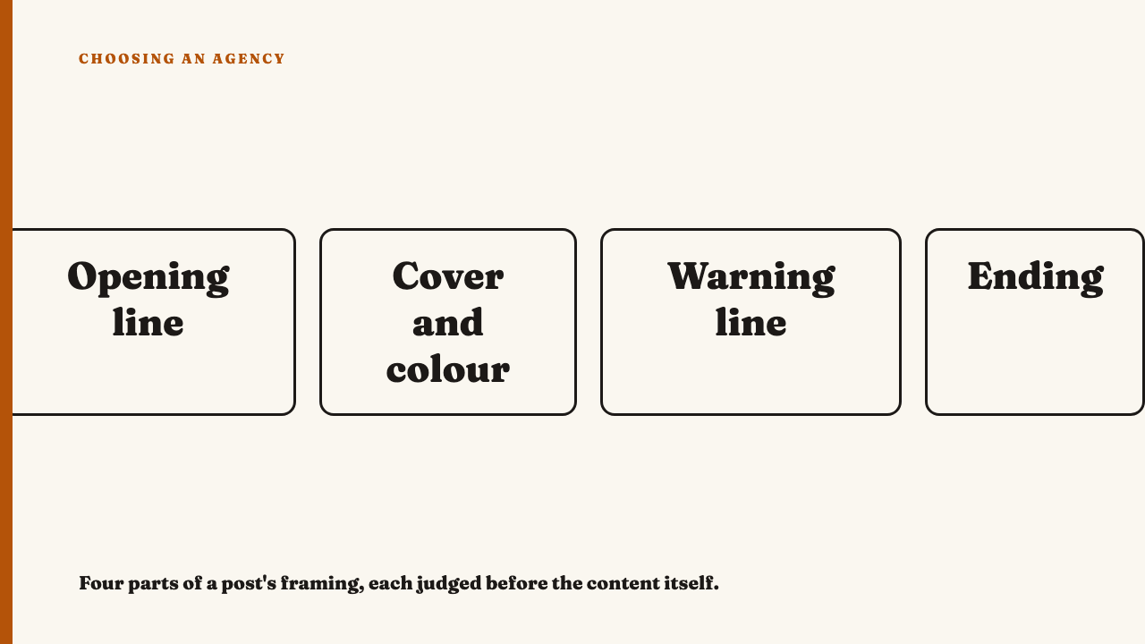
What the framing is made of
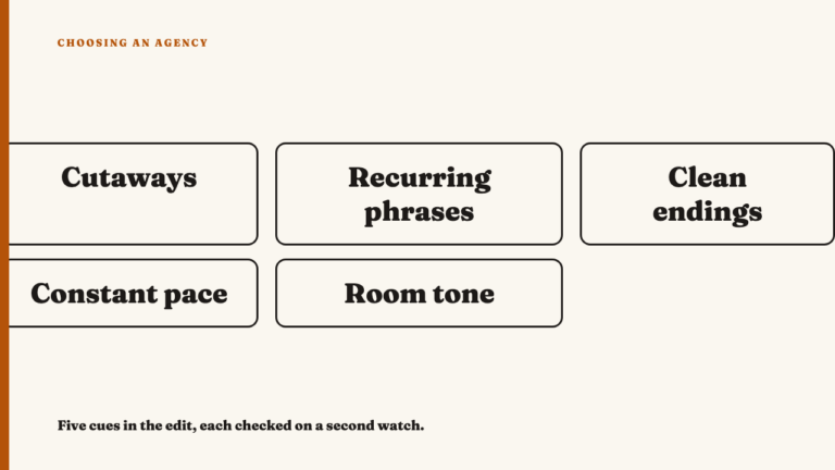
- The opening line or first frame. Considered: it says plainly what kind of post this is. Careless: it opens with a hook borrowed from a lighter format.
- The cover and colour treatment. Considered: palette and type match the weight of what follows. Careless: the feed’s default template, unchanged.
- Any explicit warning or context line. Considered: it says what is coming and lets the viewer decide. Careless: a stock label that could sit on any post.
- What sits at the end. Considered: support information, a quiet next step, or nothing. Careless: a sales line or a cheerful prompt.
The warning is only one component. A post can carry none and be framed well, or carry one and be framed badly. A disclosure label is also a design decision, and the same logic applies.
Proportionate weight: the main thing to look for
Weight is how much seriousness the framing gives the subject relative to what the content actually is. Too breezy looks like a bright palette, an emoji in the first line, a pun or trend format laid over a heavy subject, and a cheerful call to action right after.
Too heavy is the reverse: a long solemn preamble before a short or mild piece of content, dramatic black frames, language that treats a modest post as a grave one. It borrows seriousness the content has not earned.
A quick test: cover the content and read only the framing. Does it tell you truthfully how heavy the content is? If uncovering it would surprise you in either direction, the weight is wrong.
Clear, not clinical
Take three invented openings for a post about burnout.
Euphemism: “Some of us have been having a bit of a wobble lately.”
Boilerplate: “The following content may contain material some audiences find sensitive. Viewer discretion is advised.”
Plain: “This post is about burning out. It is honest about how bad it got.”
The first dodges the subject. The second reads like legal cover, and a warning in the voice of a compliance department tells the viewer the brand was protecting itself. The third names the subject and lets the viewer decide.
The wording should still sound like the same brand, only quieter. A sudden change to a voice the account has never used is itself a signal. See when a brand voice is distinct and when it is only loud.
Visual restraint and the performative tell
Restraint looks like this:
- Fewer elements than the account’s usual posts.
- No motion effects or trending audio under the opening.
- No stock image of a person in distress.
- Type that does not compete with the message.
Performative framing looks like this:
- The subject appears for one post in an otherwise unchanged feed.
- The framing centres the brand’s feeling rather than the subject.
- The post ends in a product or a follow prompt.
To tell consistent care from occasional care, scroll the feed before and after the post. One careful post surrounded by business as usual is a signal, not proof of intent.
Reading it as an agency’s work, not just a brand’s post
A visible framing decision is evidence of judgment. Framing that looks inherited from a template or a legal pass is evidence of the opposite. Put two questions to a portfolio piece: what did the first second promise, and what would the post lose if the framing were removed?
From outside you cannot see what the client mandated. The claim is about what the finished post shows, not about the agency’s process.
A short worked reading
This example is hypothetical and not drawn from any real account. Imagine a short video from a home-goods brand about a founder’s first year after a family death.
- First frame: a plain still of a kitchen table, one line: “This is about grief.” Proportionate and direct.
- Cover and colour: muted, but set in the brand’s usual rounded font in its usual orange. A close call. The familiar type keeps it recognisably the brand, though a quieter weight would sit better.
- Warning line: none, which is fine, since the first frame already said what is coming.
- Ending: a link to a support organisation, then a small “shop the range” tag. The first is considered, the second undoes some of it.
Overall: mostly well framed, with a weak ending. Someone could defend either verdict on the font, which is the point. The method gives you things to look at, not a score.
Where this stops being craft
A well-framed post can still be the wrong post to publish. This piece covers framing craft only. Careful teams look to outside references; Samaritans, for one, publishes media guidelines for journalists on covering suicide safely. For timing under pressure, see what makes a crisis response well written.
Next time a brand posts about something hard, read the weight, the wording and the ending before the content.
See the work we have selected
See this year’s selections, or nominate an agency whose work holds up.
FAQ
Does a good sensitive-topic post need an explicit content warning?
No. The warning is one framing component among four. Judge whether the opening, cover and wording together tell the viewer truthfully what is coming. A post can pass with no label and fail with one.
How can I tell a brand is performing concern rather than showing it?
Look at the feed around the post and at how it ends. One-off treatment, framing centred on the brand’s feelings, and a product or follow prompt at the close are signals, not proof of intent.
Sources
- Samaritans’ media guidelines, fetched 2026-10-01