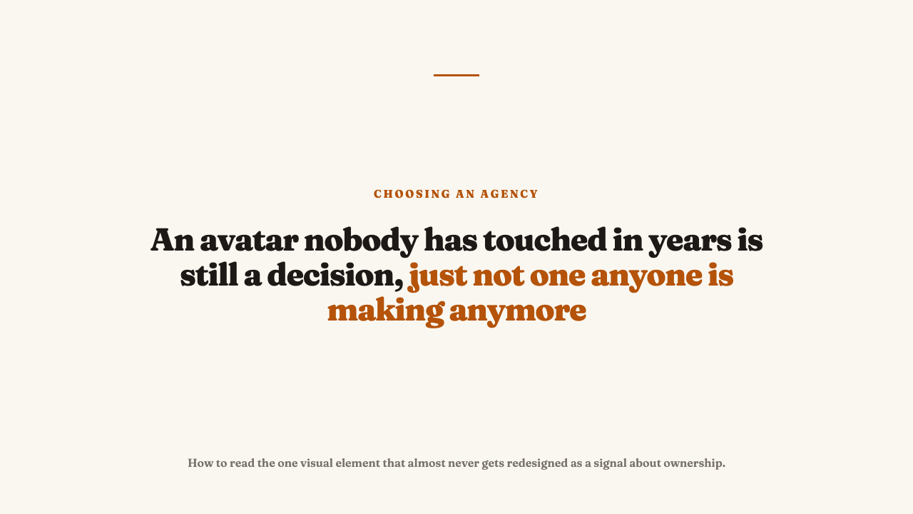
The Profile Photo Nobody on the Account Ever Redesigns
An agency can rebuild a brand’s grid three times over and never once open the file for its avatar. That small circle sitting next to every post and comment keeps whatever was dropped into it on day one, and almost nobody ever asks whether it still earns its place.
The one element that outlives every content calendar
Everything else on a managed account moves. The grid gets refreshed on a cadence, captions get rewritten season to season, even the bio gets a pass whenever there is a new offer to push. The avatar is different. It gets set once, during account setup, and then left alone, often for years, while everything around it changes underneath it.
That makes it a useful test case precisely because nobody is actively managing it. An actively managed element only shows you the account as it is being cared for right now. An avatar nobody revisits shows you what the account looked like the day someone stopped paying attention to it, which a grid refreshed this week cannot tell you. An avatar that has not moved in three years says something about whether anyone owns the whole surface, not just the parts that get scheduled.
What a generic avatar actually looks like
Once you start looking for it, the pattern is easy to spot without naming a single real brand. There is the logo cropped tighter than it was designed for, so at thumbnail size it reads as a smear of color with no shape you could describe. There is the founder headshot, visibly several years and one haircut out of date, still standing in for a person who has since rebranded themselves on the platform underneath it. There is the placeholder mark, clearly meant to be swapped out before launch and simply never was, quietly announcing that nobody circled back.
The tell shows up fastest at the size the avatar is actually seen. Most platforms render it as a small circle next to the account name, well under the size anyone would call legible for fine detail. Anything that only works as a rectangle, or only reads clearly at full resolution, is a decision nobody tested at the size it lives at every day. A logo that looks fine in a brand deck and unreadable next to a comment was approved somewhere upstream of anyone checking how it actually gets seen.
What a deliberately designed avatar looks like instead
- A mark simplified specifically for a small circular crop, built for that shape from the start rather than a rectangular logo squeezed into a circle and hoping for the best.
- Legible at thumbnail size, with no fine detail, thin strokes, or delicate type that vanishes the moment the image shrinks down to how it actually appears in a feed.
- Consistent across every platform the brand is on, so the same crop, the same color, and the same version of the mark greet you whether you meet the account on one platform or another.
Why this is a system question, not a taste question
The claim here has to be stated carefully. A stale avatar does not prove an agency is bad at the work inside the feed. Plenty of accounts run a tired profile photo while the content underneath is genuinely sharp. What it is, instead, is a small, real signal that whoever owns the account is not treating every visible surface as part of one designed system.
There is a real counterargument, and it deserves to be named rather than waved past. A brand’s own internal team sometimes locks the avatar and will not let the agency touch it, whether out of caution or a decision made two brand cycles ago that nobody has revisited. In that case the stale avatar says something about the client’s process, not the agency’s craft, which is exactly why this signal has to be weighed alongside what is happening inside the feed, never read on its own. If the feed is sharp and only the avatar is frozen, the more likely story is a locked asset. If the whole account feels similarly untouched, the avatar is just the most visible symptom of a broader pattern.
How to check it yourself in under a minute
- Pull up the same brand’s avatar on every platform it has a presence on and put the images side by side.
- Look at each one at the actual thumbnail size the platform displays it at, not zoomed in. Ask whether the mark still reads clearly at that size, or whether it has collapsed into a blur.
- Check for any mismatch between platforms: a different crop, a different color version, an older logo lingering on one platform after the others were updated. That mismatch is the tell that nobody standardized the avatar once and checked back on it since.
Where this fits in the wider read of an agency’s work
Treat the avatar as a minor, corroborating signal rather than a standalone verdict. On its own it tells you little. Set next to the grid, the captions, and the account’s overall consistency, it either confirms what you were already seeing or raises a question worth asking before you decide the client locked it themselves. Either way, the more decisive test is still whether the agency built a system or just one good post. The avatar is one small data point inside that judgment, not a substitute for making it. If you know an agency whose visual system, avatar included, holds up under this kind of scrutiny, you can nominate an agency for editorial consideration.
FAQ
Is an outdated avatar always the agency’s fault?
No. Brand teams sometimes lock the avatar themselves and never let the agency touch it, whether for internal approval reasons or simple inertia. Read this signal alongside the feed rather than treating it as a standalone verdict on the agency’s craft.
Why does the avatar matter if nobody looks at it closely?
Because it is seen constantly, at very small size, next to every post and comment, even when nobody consciously registers it. That constant, low attention exposure is exactly why it rewards deliberate simplification for a small circular crop rather than a logo that only looks right at full size.
What is the fastest way to spot a neglected avatar?
Run the side by side, cross platform comparison: open the same brand on two or three platforms and check whether the mark is the same crop, the same color, and the same version everywhere. Any mismatch is the tell that nobody standardized it once and checked back on it since.