Judging whether an agency built a system or just one good post
You found one post in an agency’s feed that stopped you scrolling. Sharp type, confident crop, colour doing something deliberate. The harder question: does the rest of the work look like that, or did you find the one frame worth screenshotting?
Why one post is the wrong unit of judgment
A portfolio’s lead image is a sample of one, chosen because it is the strongest thing in the folder. Judging an agency on it is like judging a restaurant on the plating photo instead of the kitchen. It shows the ceiling on the best night, not the method behind the average day.
A strong post happens without a system behind it in three ways. A designer had a good day, or got a week for an asset that normally gets an afternoon. A template got lucky, fitting one photograph and falling apart on the next. Or a trend format did the work, resolved by someone else before this agency touched it. It is the trap in one excellent campaign tells you almost nothing, narrowed to a single frame, and part of what a portfolio leaves out.
What a visual system actually is
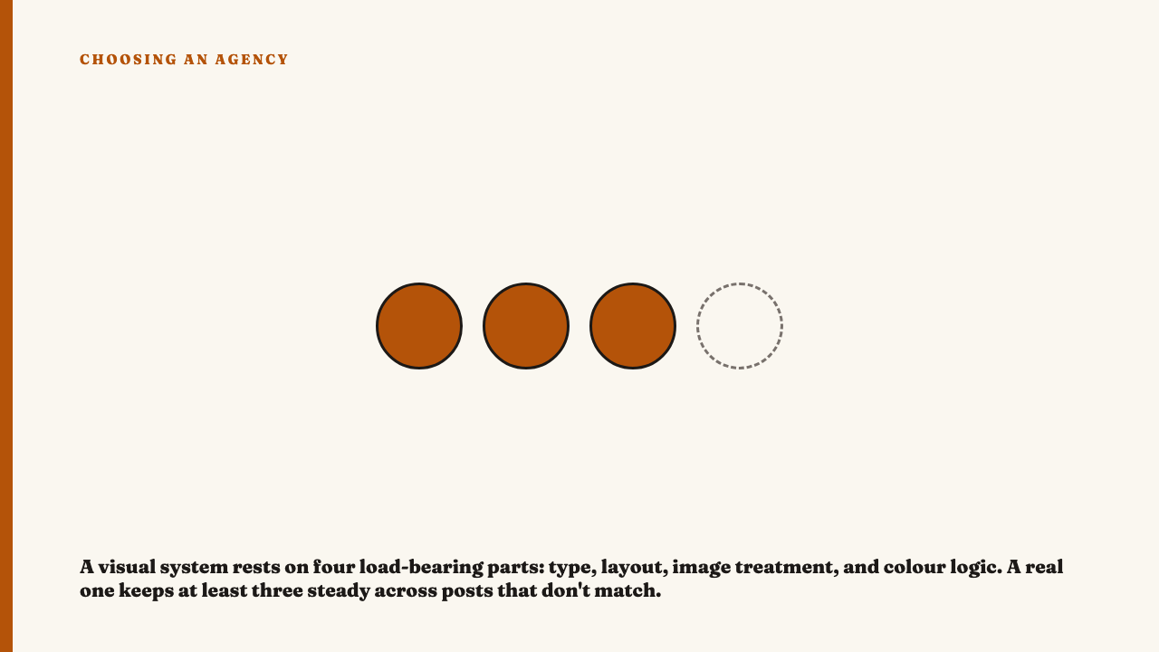
A visual system has four load-bearing parts. A recurring type treatment is the same typeface pairing used with the same logic: headline weight and size behaving consistently against body copy, and the same handling of a pull quote every time. A layout grid means consistent margins, a safe zone keeping text clear of platform interface, and a settled answer to where copy sits relative to image. A repeatable image treatment means photography graded and cropped to a house standard, not dropped in as supplied.
The fourth is a colour logic. A mood board of on-brand colours is not a colour logic. A colour logic tells you which colour does which job: one pairing always marks educational content, another always marks product. If you can predict the palette from the content type before reading the caption, that is a logic. A system holds at least three of the four steady across unlike content.
The scroll test: how to actually check
This takes about four minutes.
- Open grid view, not the feed. One post at a time is the unit that fools you; a wall of tiles is where a system shows or does not.
- Scroll back six to eight weeks or thirty posts, whichever is further. That window is this piece’s recommendation, not an industry standard.
- Look for the type treatment on unlike posts: a quote post, a product post, a behind the scenes post. Does the logic survive all three, or only the easy ones?
- Test whether the palette repeats in a way that feels ruled. Coincidence looks scattered; a rule puts the same colour on the same kind of post every time.
- Check margins and text placement across those three. Copy in the same third of the frame regardless of the image behind it is a system. Copy wherever the image left room is not.
- Look at what comes right after the post that impressed you. Format, type and colour all changing with no rule is the tell that the good post was an event, not an output.
What a real system looks like versus what a good day looks like
Picture a composite account. Every carousel opens on the same title card treatment, same type size, same position. Two colour combinations do the categorising, one on education content and another on product, consistently enough to name the post type from the thumbnail. Body copy always sits in the lower third, whether the image behind it is a studio shot or a phone photo.
The failure case: one post uses a bold serif headline on a tight grid and is genuinely good. The next uses a different font, a busier layout with copy in three places, and a colour appearing nowhere else in the grid. No thread connects them. That is not range, it is absence.
Systems can flex, and a new content pillar can introduce a new treatment, but a real flex gets repeated. A treatment that appears once and vanishes was not a decision, it was a mood.
Where systems evolve, and where that is inconsistency wearing an excuse
The objection: brands change, and an account mid-rebrand looks inconsistent for reasons unrelated to discipline. Fair, but transition and noise look different on the wall. In a transition, the old system phases out over a handful of posts as a new one phases in, both internally consistent through the overlap. Noise has no such structure, just variation with nothing carrying through.
The practical read: take the post that impressed you and find two others sharing a specific choice with it, the same type treatment, the same colour doing the same job, the same placement. If you cannot find two, the account has no system to credit right now, whatever the reason.
What this does and does not tell you about the agency
A strong system tells you something narrow and valuable: the agency can hold a design language steady across months of output, including on the posts that were boring to make. That is discipline, checkable from outside, and the same instinct that separates concept work versus work that actually shipped.
What it does not tell you is whether the thinking underneath was any good. A beautifully systematised account can be aimed at the wrong audience, and reading strategy from public output is a separate exercise. Whether the numbers hold up, and how you vet the agency itself, are different questions from this one.
Where to see this applied
The selections here are editorial, and each entry says what stood out and why. See this year’s selections, or if you know an agency whose work holds up to this kind of scroll, nominate an agency.
FAQ
How many posts should I look at before judging whether an agency has a real visual system?
Six to eight weeks of posting, or roughly thirty posts, whichever is longer. That is a rule of thumb, not a standard. A shorter window can be covered by one strong run. Grid view makes it fast: you are scanning thumbnails for repetition, not reading posts one at a time.
Does a strong visual system mean the agency’s strategy and results are also good?
No. A visual system is evidence of design discipline and nothing else. Consistency says nothing about whether the content was aimed at the right people, built on a sound idea, or effective once it shipped. Those are separate questions with separate evidence.