When work looks bad on purpose, does the choice earn it?
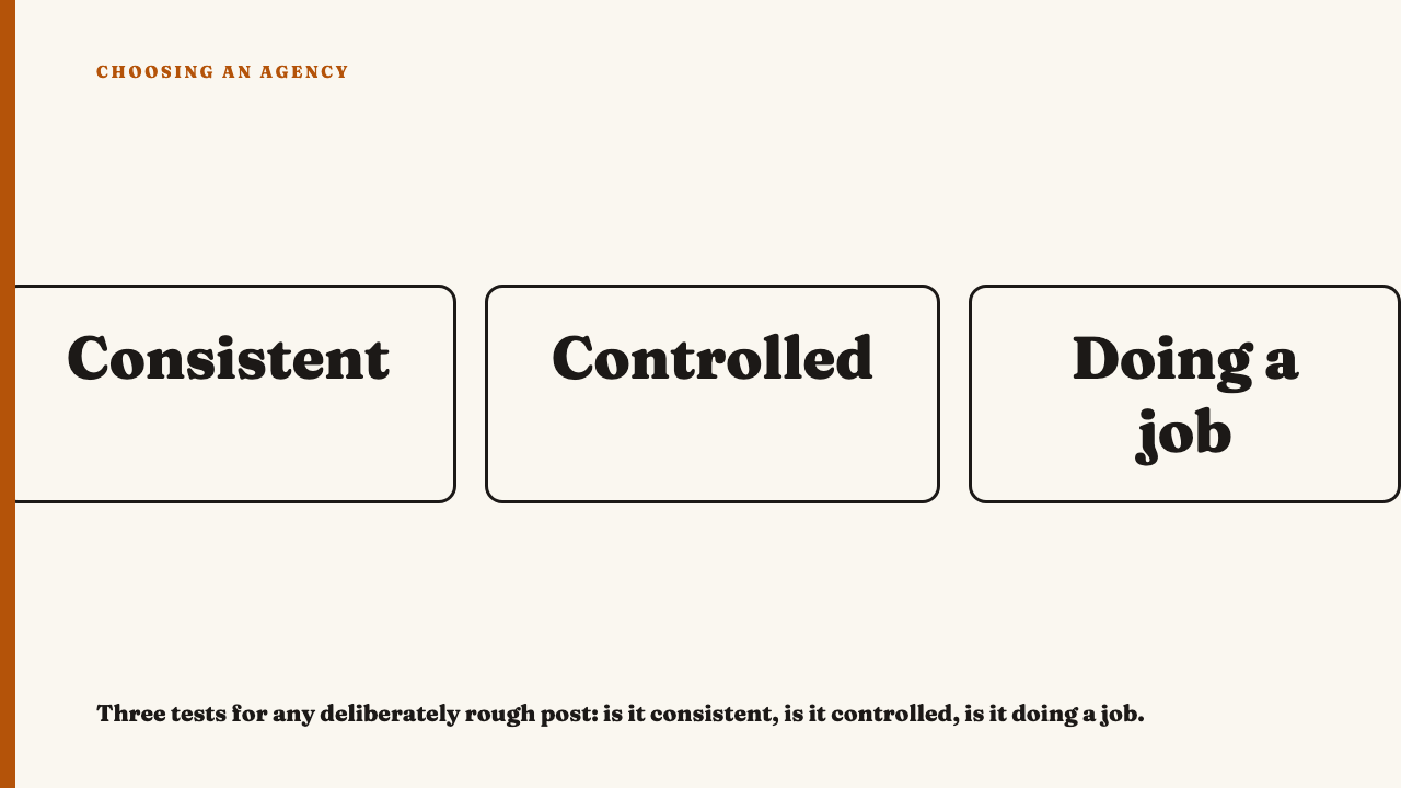
You are looking at a portfolio post that seems deliberately ugly: wobbly hand-drawn captions, a shaky phone clip, a flat flash-lit photo. You cannot tell whether someone made a smart decision or simply did not finish the job. Three checks, all visible on screen, will get you most of the way.
Why a polish-trained eye gets this wrong in both directions
If you learned craft from clean work, your eye fails two ways. The first error is marking down a deliberately crude post because it does not look expensive. The second is waving through a careless post because someone can say “it is meant to look like that.”
The sentence worth keeping: roughness is a material like any other, and the question is whether it was handled or merely left in. An agency’s account of its intent is not the test. An explanation of a post is information about the post, something to check against the screen.
Test one: is the roughness consistent?
Deliberate crudeness behaves like a rule. Accidental crudeness behaves like weather.
A rule looks like the same wobbly hand-drawn type across slides, the same blown-out phone-camera look through clips and posts, the same off-centre framing every time. The ugliness has a recognisable grammar. Weather looks like one slide with careful text placement and the next with type crowding the edge, or three clips with matching grain and a fourth from a visibly different source. It is crude in places for no pattern anyone could name.
The practical check: open the account, look at five neighbouring posts, and ask whether you could predict what the next one will look like. If the crudeness is a choice, it should be predictable in kind, even when the content is not.
Consistency over time separates a system from one lucky post, and that holds for a lo-fi look as much as a polished one. See whether an agency built a system or just one good post.
Test two: is the roughness controlled?
A designer breaking a rule still knows where the rule was. Grain, shaky framing, uneven type, flat lighting and a cheap-looking transition are all allowed to be rough. The timing of the punchline or reveal, the legibility of the words that matter, the audio the viewer needs, and where the eye lands first must stay exact.
The tells of an accident are practical failures. Text is clipped at the edge of the frame. A caption sits where the platform interface could cover it. A cut lands a beat early because nobody watched it back. Audio peaks by mistake rather than for effect. A compression smear falls on the one detail the post is about.
The tells of control look different: a shaky shot that still holds the subject in frame, hand-scrawled type that is readable at phone size, a rough cut whose comic or emotional beat lands on time. It is the discipline behind the editing decisions that separate good social video from filler.
There is also a legibility floor. WCAG asks for a contrast ratio of at least 4.5:1 for normal text and at least 3:1 for large-scale text. That is a web accessibility standard, not a platform rule, but it anchors what “readable” means. Messy video must stay followable too, which is why alt text and captions as a craft signal matter on the crudest work.
Test three: is the roughness doing a job?
Imagine the same post cleaned up. If it would lose its trust, its joke, its sense of being made by a person, or its fit with the audience, the roughness was working. If it would simply look better and lose nothing, it was an excuse.
Roughness can plausibly signal that a person and not a committee made the thing, puncture a category where everyone else looks glossy, match the register of the audience’s own posts, make a joke land by deflating it, or lower the guard of a viewer who ignores anything that looks like an ad. The failure case is roughness copied because it is fashionable, applied where trust depends on looking careful, or used to cover a missing idea.
You can rarely see the brief, so the judgement is not about proving intent. It is about whether a plausible job is visibly being done.
Earned roughness and an accident dressed up as style, side by side
| Test | Earned | Accident |
|---|---|---|
| Consistent | The same hand-drawn type and grain recur across five neighbouring posts. | Careful text on one slide, type crowding the edge on the next. |
| Controlled | Shaky footage, but the punchline lands on the beat and the audio stays clear. | A cut lands early, audio peaks by mistake, a caption is clipped. |
| Doing a job | Cleaned up, it would lose its joke or human feel. | Cleaned up, it would just look better. |
A post can fail one test and pass two, and the count of tests passed matters less than which one failed.
When you still cannot call it
- Look for range. An account polished elsewhere and crude here is making a choice. One that is crude and inconsistent everywhere is more likely limited.
- Watch at the intended size and speed. View it on a phone, in a scroll. Some roughness only reads as deliberate at that scale, and some falls apart on it.
- Hold unresolved calls as questions. Carry them into the portfolio review rather than forcing a score. Some work will stay ambiguous.
- Prefer stated reasoning. Editorial picks that say why work was chosen give you something to test against your own eye, which is how this site approaches its selections.
For the broader criteria, see what separates good social media work from average.
See the reasoning applied
Our selections are editorial, and each says why the work was chosen. See this year’s selections, or nominate an agency whose work deserves a closer look.
FAQ
Is lo-fi content lower quality than polished content?
No, and there is no simple ranking. Lo-fi can be very controlled work and polished can be empty. Quality depends on whether the choices serve the post, not on how expensive it looks.
What is the most common giveaway of accidental sloppiness?
Inconsistency in kind: some elements carefully handled and others not, with no pattern, plus small failures such as clipped text, mistimed cuts or audio that peaks by accident. These are tells, not a guaranteed diagnosis.
Sources
- W3C, Understanding Success Criterion 1.4.3: Contrast (Minimum), fetched 2026-09-24