Is the App Sitting on Top of the Work? Check the Safe Zones
You are watching a vertical video from an agency’s portfolio, and it looks excellent. The type is crisp, the composition feels deliberate, the best line lands. But you are looking at the canvas, and nobody scrolling a feed ever saw the whole canvas. Whether the agency knew that is one of the quieter tests of craft.
The portfolio shows you the canvas. Viewers get the canvas minus the app
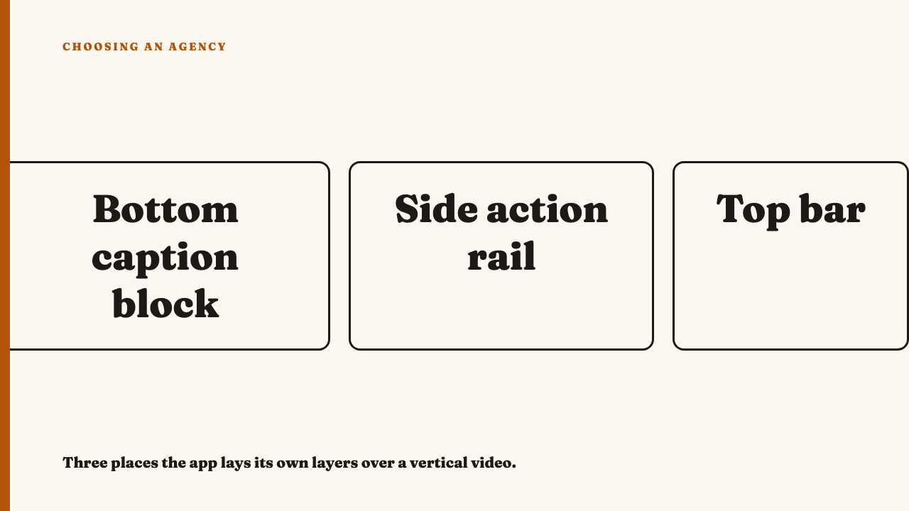
A clean export is a different object from the thing a viewer scrolled past. Once a vertical video is live, the app lays its own furniture over it: a caption and account name block low in the frame, an action rail of buttons down one side, a status or search bar across the top, and sometimes a progress bar or sound label along the bottom edge. Placement differs between apps and formats and changes over time, so treat this as a general map, not a spec.
You are not grading the app’s design. You are asking whether the agency knew the layers were coming. That makes this a composition skill, closer to knowing where the fold falls on a printed page than to a technicality.
Picture a title card with the key line set in the lower third. On a laptop it reads beautifully. In the feed, the line sits directly under the caption block, half hidden behind the account name and the first line of post text. It lost the sentence it was built around.
Where the covering happens, and what gets lost there
- The bottom area. Burned-in captions, price or offer text, calls to action and product names drift here. It is the most abused spot because it feels like a natural subtitle position on a horizontal screen, and horizontal habits die hard.
- The side rail. Faces, hands holding a product and logos pushed toward the right edge end up behind icons.
- The top bar. Dates, titles and handles placed hard against the top edge sit under the status or search bar.
Not every loss matters. A decorative element covered is harmless. The punchline word, the product label or a face’s eyes covered is a craft failure.
What composing for the visible frame looks like
Take a piece where a person talks to camera and a short line of text appears. The face and the text sit in the middle band with room to spare. The edges carry only things that can be lost: background texture, soft light, secondary motion. When a button lands on a corner, nothing the viewer needed was in it.
The first tell of deliberate work is a text block sitting noticeably higher than a horizontal-habit layout would put it, with a margin that looks oddly generous on a clean export. That odd margin is the skill.
The second tell is quieter. The agency lets a face or product run to the full canvas but keeps every word out of the risky zones. The image bleeds and the message does not. Good work degrades gracefully: cover any edge and the viewer still gets everything they needed.
How to test it yourself in about five minutes
- Do not judge from the clean file. Open the live post in the app on a phone, or ask for a screen recording of it playing in the feed.
- Pause on the key frames. Stop on the frames carrying the key text and key image and check what the interface is sitting on. Check with the caption block expanded as well as collapsed, since the long-caption state can cover more.
- Watch it twice. Once with attention on the edges only, once on the centre only. If the centre tells the whole story, the piece was built for the visible frame. If you need the edges to follow it, the two experiences differ, and that gap is the problem.
- Compare reposts. If the agency posted the piece on more than one platform, look at each live post. An identical layout across apps whose overlays sit differently is a sign of no adaptation.
This sits after two other checks. Physical size is covered in judging a post at the size it was actually seen, and a still or clean export is the subject of work you can only see flattened. Burned-in captions are the text most often caught in the covered zone, so designed for sound-off viewing meets this check directly, and a cover crop is another place where the visible frame is smaller than the canvas, as in thumbnail and cover image design.
Reading a portfolio reel that has been exported clean
A clean reel can still leak evidence. Text hugging the bottom or top edge is a warning. Generous margins on every side suggest the team knew about overlays.
A reasonable request is to ask to see the live post, or a screen capture of it in feed. An agency that cannot produce one for work it says shipped is telling you something about how closely it looked at its own output.
Be fair: a piece may have been made for a placement with different overlays, such as an ad format, or may be deliberately full-bleed. Ask whether the choice looks intended before assuming a miss.
When the rule is broken on purpose
A piece can let the interface become part of the joke or the layout, such as a line meant to be half hidden. You can tell it is intentional when the covered part is recoverable or irrelevant and the viewer is never left guessing. If they have to wonder, it was a mistake wearing a costume.
A cinematic piece where the images carry everything and no text matters is another case. Safe zones barely apply, so do not penalise it. Carry one test away: after the overlays are on, did the piece lose anything it needed?
Where to go next
To see how we look at work, See this year’s selections. Know an agency whose work holds up inside the app, not just on the export? You can nominate an agency.
FAQ
What is a safe zone in social video?
It is the part of the vertical frame the app leaves uncovered, in general the area away from the bottom caption block, the side action rail and the top bar. Exact boundaries differ by platform and change, so look at the live post rather than memorising a number.
Can I judge this from a clean export?
Partly. Edge-hugging text is a warning sign even on a clean file, but the proper test is the live post or a screen recording of it in the feed.