Judge social work at the size it actually shipped at
You are four slides into a portfolio on a laptop, and you cannot tell whether any of it was legible to its audience.
You are reviewing in conditions the work never had
Review happens in a room built for presentation: big display, one asset at a time, no neighbours, attention already granted, freedom to look twice, sound on.
None of that was true for the audience, and every comfort favours the agency. The distortion is systematic: it hides the two failures that decide whether a post did anything, unreadable type and a frame that read as nothing at speed.
A deck is a presentation format, a feed is not. Work can be well made for a deck and have failed where it ran.
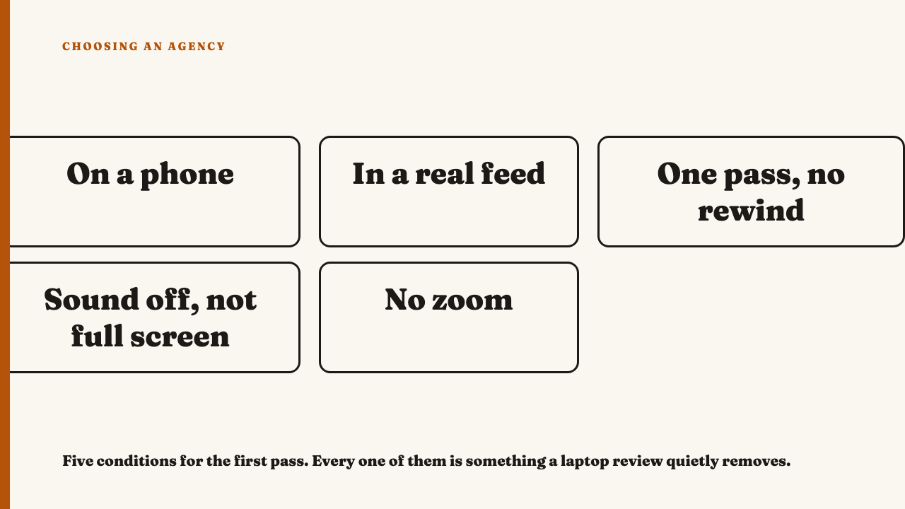
The first pass has five conditions
- Hold it on a phone. Physical size is the variable, and a scaled window is not it.
- View it in a real feed where you can, not a white slide, so it survives neighbours.
- One pass at scroll speed, no rewinding, no pausing: the attention a thumb gives an unsought post.
- Sound off, not full screen, which is how feeds start a video.
- No zoom, no pinching to read the small line. The audience did not.
Write down only what you registered on that pass, before looking again.
What fails at real scale, and it is almost always the type
A headline set for a 1400 pixel wide slide is a grey shape at thumb scale, a word you can see and cannot read. Type baked into an image cannot be enlarged or reflowed: the accessibility standard expects text to survive being resized by the reader and exempts images of text, so the viewer is stuck with the designer’s size.
Contrast fails locally, which is why a deck hides it: text that clears the slide’s calm crop dies over the busy photograph that shipped. The standard treats contrast as a measurable floor, asking less of large text than small, so shrinking a headline drops type below the line with no colour changed. Thin weights and tightly tracked condensed capitals lose their counters first.
Then there is type where the interface sits: caption block, username, action column, progress bar, all designed on a rectangle the viewer never sees, the mark of a crossposted asset. A subject shot from too far back fails differently: at real scale the thing the post is about occupies a few dozen pixels. Can you read every word without moving the phone closer to your face.
What fails at real speed, and why the first frame decides it
Four elements arriving in the same half second, none winning, reads as noise, not density. That half second is how fast to move your thumb, not how long anyone looks.
A logo, a title card or a slate as the opening frame spends the only guaranteed moment of attention on nothing. Harder to spot: a frame legible only once you know the campaign, the reviewer’s condition and never the audience’s.
A strong piece you can describe after one pass, a weak one only after three, and noticing which happened is the judgement. Do not flip into rewarding whatever is loudest: a frame can be instantly legible and worthless.
The real size differs by format
Start with a carousel, and what it owes the reader slide by slide. Judge slide one at thumb scale, then whether the swipe cue reads at that size, then whether slide two follows for a reader who took slide one at speed. A laptop lays them in a row, handing you the argument unearned.
A static graphic for a profile grid will be seen three columns wide, thumbnail sized, beside eight others, so judge it there. Full width shows a poster, the grid a tile.
A long caption gets cut, so find the truncation point and ask whether the visible portion earns the tap, a narrower question than whether the caption was written or filled in. A deck hides that cut by printing it whole. A vertical full screen asset needs the interface furniture put back top and bottom, where a designer working in a plain 1080 by 1920 rectangle put something important.
The second pass is where you are allowed to be forensic
The second pass is for typographic detail, edit rhythm, the writing in the caption, slide order, colour discipline across a set: craft that rewards attention and is invisible at speed, and where most of what separates good social work from average lives.
The passes are asymmetric. A piece that failed the first cannot be rescued by the second, nobody saw the detail. One that passed can still fail it.
The limits: you are one viewer on one device, your phone is not every phone, and an asset made for a placement you cannot reproduce is judged roughly. The first pass filters two failures, legibility at real scale and at real speed, and settles nothing about whether the strategy was right or what the work did commercially.
If a portfolio survives both passes, nominate an agency for editorial consideration.
FAQ
Is looking at work on my own phone reliable, given that every phone is different
One device is one sample, and size, brightness and quality vary. It still beats the alternative, because the error has a known direction: a laptop flatters consistently, a phone misleads randomly.
What if the agency only shows work in a deck and I cannot see it in a live feed
Open the asset at native dimensions on a phone, not as a slide, then ask for the live link or the handle. An agency that cannot say where a piece ran is a separate problem, covered in telling concept work from work that shipped.
Does this mean dense or detailed work is automatically bad
No. Density that resolves into one clear reading at speed is a craft achievement. If one dominant element lands immediately and the detail rewards a second look, the piece is working. If four sit at equal weight and the eye picks none, that density resolves into nothing.
Should the first pass decide it on its own
No. It is a filter, not a verdict. It catches two failures cheaply, before a large screen forms your impression. Most of the craft judgement happens on the forensic pass, and running them in that order is what protects the judgement from your viewing conditions.
Sources
- WCAG 2.2, Contrast (Minimum), fetched 2026-09-08.
- WCAG 2.2, Images of Text, fetched 2026-09-08.
- WCAG 2.2, Resize Text, fetched 2026-09-08.