Where an agency puts the logo shows who the work was for
You are watching a reel and the footage is good. A product is lifted from a box, the light is right, the hands are steady. At second one a small logo appears in the top corner and stays. Nothing is wrong with the shot, yet your eye keeps drifting to the corner, and the moment you were meant to feel is shared with a sticker.
The feeling you cannot name
A brand mark in a social video is an edit decision. It has a position, a timing and a reason, like a cut or a caption. The thesis is simple: a mark is either placed where the edit earned it or placed where a checklist required it, and you can usually tell from the timing.
This is about marks in frame across the whole piece, not the closing beat, which judging how a post ends covers. What you conclude is a read from the outside, not a verdict on who made the call.
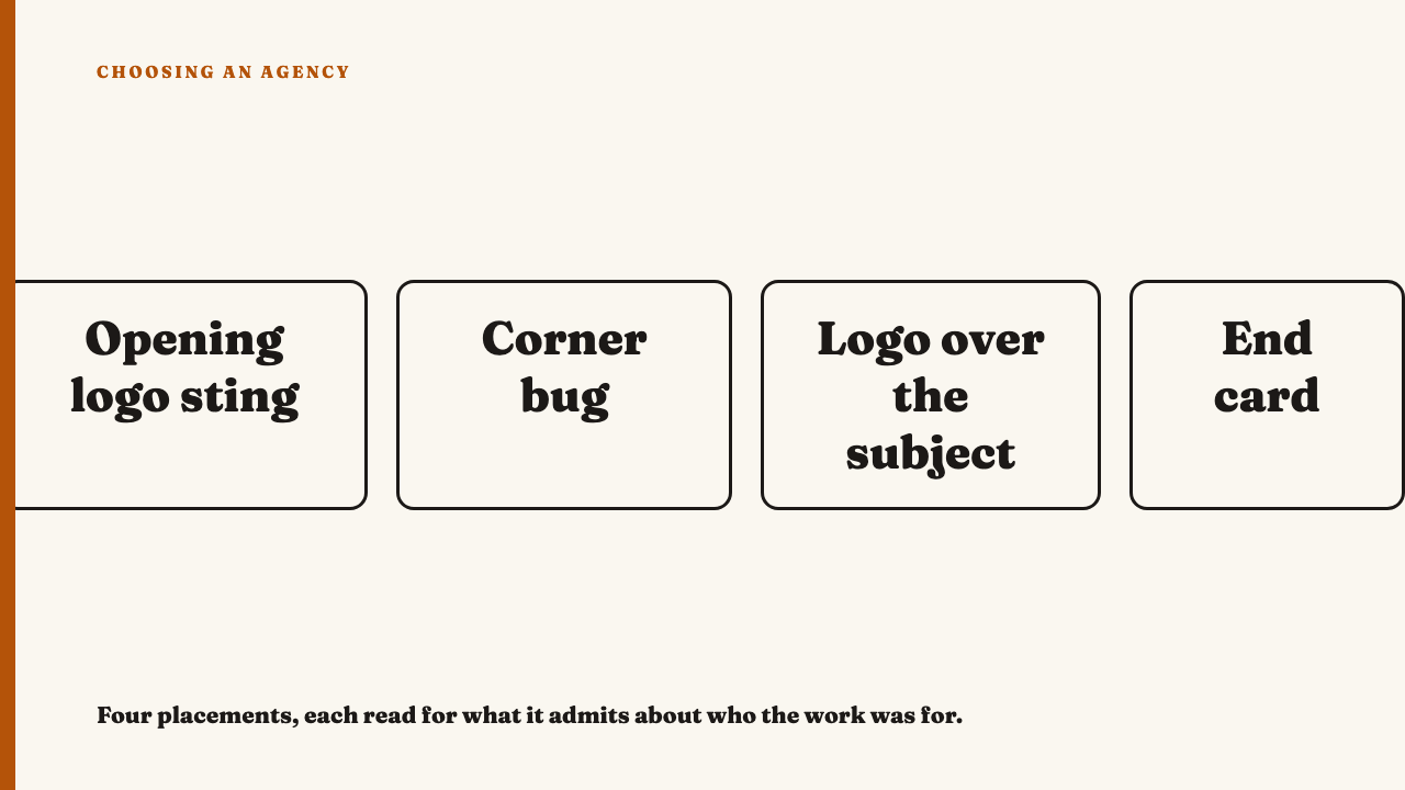
Four placements and what each one admits
| Placement | What you see | Why it exists | The tell it was applied |
|---|---|---|---|
| Opening logo sting | A short animated logo before the content | Identifies the account when a clip travels | It delays the first image and is the same animation every time |
| Corner bug or watermark | A small mark fixed in one corner throughout | Keeps attribution if the clip is shared | It never fades or resizes and ignores the footage beneath |
| Logo over the subject | A mark laid across a face, product or screen | Puts the brand where eyes already are | It sits on glass above the picture, not in it |
| End card | A closing frame carrying the mark | A clear sign-off | A hard cut to a flat slide unrelated to the last shot |
Some marks are not the agency’s call. A platform watermark on a downloaded and re-uploaded clip is nobody’s design. Some clients mandate a visible bug in their brand guidelines. A platform watermark has the platform’s look; a mandated bug repeats across one client’s work but varies between clients.
A persistent bug is not automatically bad. The test is whether it was sized, placed and faded with the footage in mind. A small mark that eases out when the picture gets busy was thought about. One at full opacity through every cut was not.
Timing is where the decision shows
Compare two logos. One lands once, right after the payoff or the laugh, when the edit has built to a moment and the picture has settled. The other appears at second one, and again at the same point in every video on the account, whatever the footage is doing. The first reads as chosen. The second reads as stamped.
Test it as a viewer: scrub a few videos from the same account. If the mark arrives in the same position at the same moment whether the footage is a quiet pour or a fast montage, a rule is being applied. An earned arrival has a shape: the cuts have been getting somewhere, the motion stops, and the mark has room. It is the instinct behind editing decisions in social video, applied to a logo.
Position, size and what the logo is sitting on
Look for three collisions:
- Over the subject. The mark crosses a face or hands and competes with what you were meant to watch.
- Under the platform’s interface. Vertical video carries captions, an account name and buttons over parts of the frame, so a logo placed there can be half hidden and read as a clipped shape.
- Static on moving footage. A fixed mark over a cut-heavy edit flickers as the contrast behind it keeps changing.
Judge at the size the work was seen. A mark that looks discreet in a portfolio frame can be a smear on a phone, which is why the size it actually shipped at matters. A designed-in mark takes colour or contrast from the frame, or lives inside the picture, on packaging, a wall or a screen, rather than on glass above it.
Repetition: the same logo three times
Picture a 25 second product video. It opens with a logo sting, so the first thing you get is an animation instead of an image. A bug sits in the corner throughout, so you are half aware of it during the payoff. It ends on a larger card with the same logo. The sting cost the opening, the bug cost the middle, and the card, the third time you have been told who made this, costs the feeling the piece built. Three marks usually means three people each needed to see the logo, and that is what the viewer picks up on.
There is a fair counter-case. In a comedic or rhythmic edit, repetition can be a deliberate device. What separates it from three approvals is change: if the logo builds, shrinks or gets answered by the footage each time, it is being used. If it is identical each time, it is being stamped.
The end card as a last craft decision
Keep this to the mark. The strong version holds the final image of the piece and lets the mark arrive into it. The weak version hard cuts to a flat slide. If that slide is the same card, hold and animation across every client the agency serves, you are looking at a template doing the thinking.
A very short card, or none, can be the confident choice when the account name is already clear on the platform. To tell it from omission, look at what replaced it: a held image that feels resolved was a decision, while a piece that stops mid-motion was simply unfinished.
Reading an agency’s portfolio for this
- Watch five pieces back to back with the sound off.
- Note when the mark appears in each.
- See whether it moves in position, timing and treatment.
Varied placements across clients suggest an agency that works out the answer each time. The same placement everywhere suggests a habit or a uniform client mix. It is a signal about habits, not proof of either.
A showreel often strips or replaces the marks, so a clean reel is weaker evidence than the account’s own posts as they shipped. If you are choosing between agencies, ask for the posts as published, not the reel.
A fair verdict, not a rule
A visible logo is not a flaw and a hidden one is not a virtue. Some brands require prominent marks and the work can still be good. The question is whether the work was built to carry the mark. Try this on any piece: if you removed the logo, would the edit still have a place where it could have gone?
Where to look next
Our entries are editorial selections, chosen because the work held up under close looking. See this year’s selections, or nominate an agency whose branding reads as designed in.
FAQ
Is a persistent logo in the corner always a sign of weak work?
No. Some categories and clients require it. Judge whether it was sized, placed and faded with the footage in mind, and whether it stays identical across very different pieces.
How can I tell whether the agency or the client chose the logo placement?
Often you cannot be sure from outside. Identical placement and timing across unrelated pieces points to a rule being applied, but treat that as a signal and not a verdict.