Telling platform native work from a crossposted asset
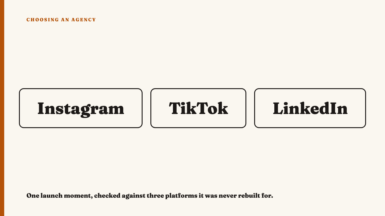
You open an agency’s Instagram, then its TikTok, then its LinkedIn page. Clean type, consistent colour, nothing embarrassing. What none of it tells you is whether the team made three pieces of work or made one and exported it three times.
What a crossposted asset actually looks like on screen
Picture a square graphic for a launch: a photograph, a headline burned into the top third, a line of copy beneath, all baked into the file. On the square feed it sits correctly, the shape it was drawn for.
Now find the same launch in the vertical slot. The square is still square, dropped into a taller frame with grey bars above and below, letterboxed into a slot it was never built for. Sometimes it runs the other way, a horizontal cut pillarboxed at the sides. On LinkedIn it appears a third time, a static image bolted above a caption, the burned-in headline typed out again below.
Three placements, three reading conditions: overlay text read at a glance, video captions in time with speech, a written post as prose. The giveaway is not that the same idea repeats. It is that the same object repeats, unchanged, in places that ask for different things.
The single check: was it rebuilt, or just resized
Reduce it to one question. For this piece of content, in this place, can you point to a decision that only makes sense here?
Resizing changes dimensions and nothing else. Rebuilding changes framing, pacing, caption placement, and almost always the opening seconds or the first line. A crop chosen for a tall screen counts. The same pixels at a new size do not.
None of it needs insider access. You are reading what shipped in public, the same discipline as reading strategy from what’s public.
The same idea, rebuilt three ways
Take a hypothetical: a café group wants to say its bread is baked twice a day. The square feed version delivers it in one static frame: a photograph shot to hold at a glance, little or no burned-in text, the caption below doing the supporting work.
The vertical version is a different build. Framed tighter, because a full bleed vertical crop sits close to a face or a pair of hands. Re-paced so the point lands in the first three seconds. The words arrive as captions timed to speech, not one block parked over the clip, because vertical video is generally built for sound-off viewing [EVIDENCE NEEDED: platform guidance confirming sound-off as a default].
The LinkedIn version inverts the hierarchy. The visual is secondary, and the idea is carried by written text with a different opening line, for someone reading a feed rather than watching one.
Side by side those three look like different pieces of content, from one idea. That is the working form of what separates good social work from average.
The tells that give away a resized asset
- Bars of empty space. Letterboxing above and below, or pillarboxing at the sides, where a differently shaped asset was forced into a slot it was not built for.
- Text under the interface. Caption or key information sitting where the platform’s own buttons and description will cover it. Every platform has a safe zone; native work respects it.
- An identical hook in two formats. The same on-screen line opening a static post and a video, ignoring that one is scanned and the other unfolds.
- One call to action everywhere. The same phrasing in a comment-driven feed post and a click-driven professional post, with no thought for what each audience will do next.
Platforms publish their own requirements and they differ. LinkedIn’s help documentation lists a supported aspect ratio range, a resolution range and duration limits for video.
Why this check beats a general impression of quality
“This looks polished” is not a judgement, it is a mood. It cannot be wrong. “This asset appears in three places with the same crop and the same burned-in caption” is specific, falsifiable, and checkable by anyone.
Volume production and platform native production look identical in a single post. The difference surfaces only in comparison, across two or three platforms, and needs nothing from inside the agency. Public output and two browser tabs.
Where this check can mislead you
The obvious failure is treating any visible difference as craft. A new colour grade, a filter, a swapped typeface: none of that is rebuilding. Cosmetic variety is cheap, and the easiest way to fake adaptation.
The opposite mistake is treating reuse as a red flag. Building on one strong asset is efficient and often correct. Genuinely recropped, recaptioned and repaced, that is adaptation, not laziness.
The question is never whether the asset looks different, but whether the change matches how people use that platform. A recolour matches nothing. A hook rewritten for readers rather than viewers does.
How to run this check on an agency’s own channels
Pick one campaign or launch moment an agency shows publicly and find it on at least two platforms. One moment across two channels tells you more than a whole feed does.
Compare four things: the crop, the pacing of the first few seconds, where the caption sits, and the opening line. Ignore overall visual style, the thing most likely to fool you. You want evidence of a decision made twice, not a template applied twice.
Do not score everything. One clear case of real rebuilding is a strong positive signal, one clear case of pure resizing a strong negative one. It is the logic that separates concept work versus work that actually shipped.
Take the check somewhere useful
To see this reading applied to work we have looked at closely, see this year’s selections. If you have run the check and the work held up, you can nominate an agency.
FAQ
What is the fastest way to check if content is platform native?
Find one campaign moment on two platforms and compare four things: framing, the pacing of the opening seconds, where the caption sits, and the first line. Ignore overall polish. If none of the four changed, the asset was resized rather than rebuilt.
Does crossposting always mean the work is lower quality?
No. Reusing one strong idea is normal and often efficient. The flag is narrower: an asset resized for a new slot while nothing about framing, pacing or captioning was rebuilt for how people consume it there. A filter or colour swap does not count.
Sources
- LinkedIn Help, Video sharing troubleshooting, listing supported file types, resolution, aspect ratio range and duration limits. Fetched 2026-08-30.