What Makes a Carousel Actually Work, Slide by Slide
You are scrolling an agency’s grid and it is mostly carousels. The opening slides are sharp: bold type, a clean claim, a colour system that holds. The work feels good, but you cannot say why, or whether that survives a closer look. The first slide takes the least craft in the format, and it is where almost everyone stops looking.
Why the hook slide is the wrong place to stop looking
A hook slide can be produced by formula, and the formulas are not secret. A bold claim stated as fact. A number set in large type. A contrarian line that inverts what the audience assumes. Any of them can be filled in by someone who never thought hard about the subject. One decisive slide is a design problem with known solutions. A whole sequence holding an argument is a thinking problem, and there is no template for that.
The hook is also the most tested surface in the format, because it is the only slide that shows in the feed preview. Everyone optimises it, which is why it tells you least about the agency behind it.
What a slide has to do to earn the next swipe
The job of a middle slide is narrow. It has to give the reader a reason to keep going that the previous slide did not already give. A slide that works adds something: an idea the reader did not have a moment ago, an example that makes an abstraction concrete, a turn that complicates what was just said. A slide that does not merely restates the last one in fresh wording.
The tell is easy to apply. Read a middle slide, then imagine it deleted. If nothing is lost, that slide was added rather than built, and a sequence full of removable slides was padded to a slide count rather than built to make an argument.
Two middle transitions, described
Picture a carousel about pricing for a hypothetical hardware brand. Slide four sets a tension: the cheapest option in the category draws the most complaints, and the priciest is not the one people recommend. The reader has a live question. Slide five resolves it with a distinction they had not made. The swipe came from wanting the answer, not from the layout.
Now the weak version. Slide four says great brands invest in community. Slide five says great brands invest in storytelling. Same template, same type sizes, same sentence shape, one noun swapped. Nothing was posed, so nothing is resolved. The reader still swipes, but out of momentum, not pull.
The closing slide is where the craft either shows up or doesn’t
The last slide is the highest leverage thing in the format, because it is the one place a carousel has to resolve. A considered close answers the question the post opened with, in language that fits only this post, and it gets more specific than the opening slide was rather than less.
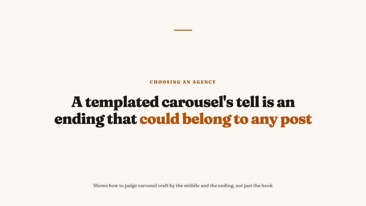
A collapsing close reads as fill in the blank. Follow for more. Save this for later. The same line that ended the previous post and will end the next. The test that makes this checkable rather than a matter of taste: imagine one carousel’s closing slide pasted onto another on the same grid. If neither reads as wrong, the ending was written for neither post. That is a template running the account, not a person finishing a thought.
Two closing slides, described
Imagine a carousel that opens by claiming a category’s returns problem is really a sizing problem. A close that pays off never repeats that sentence. It lands where the reader could only arrive after the middle slides, something like the point that the fitting room was never the thing being replaced. Swap that slide onto another post and it reads as a mistake.
The weak version could sit at the end of anything: a prompt with no connection to what was just shown, a question that does not depend on the argument. It does not close. It stops.
A strong hook with a collapsing back half is a specific tell, not a coincidence
There is a production logic behind that shape. The hook is the only slide competing for attention in a feed, and whether people swipe all the way through is far less visible in daily work than whether they stopped scrolling at all. So a template optimises the slide everyone sees and treats the rest as fill. Nobody decides this. The incentives of the format do it quietly, one post at a time.
Be careful how much you conclude. You cannot see inside an agency, and one flat ending on a strong grid proves nothing. Repetition is what matters. When most of the carousels open well and end in the same interchangeable place, treat it as a signal worth weighing. It sits close to what a portfolio leaves out, to telling concept work from work that actually shipped, and to separating platform native work from a crossposted asset.
How to check this on a real grid
- Open five or six carousels and go straight to the last slide of each before reading anything else. Then work backward and ask whether the earlier slides built toward that ending.
- Line those closing slides up against each other. Could you swap any two without either post reading as wrong? Interchangeable endings are the fastest signal there is.
- Pick one middle slide at random from each carousel and imagine it deleted. If the argument survives untouched every time, you are looking at slide count, not structure.
- Run the same pass on a second client’s grid, since one account can be an outlier.
Where to take this next
To see the standard applied, see this year’s selections, editorial picks with the reasoning attached. If a grid survives the last slide test, nominate an agency whose work holds up past the hook.
FAQ
Is a strong hook slide a bad sign?
No. A strong hook is a real skill. It just proves little on its own, because it is the easiest part of the format to reproduce from a formula. Read it alongside what the middle slides and the close do, not instead of them.
What is the fastest way to check a carousel heavy grid for templated work?
Jump to the last slide of several carousels before reading anything else, then compare those closing slides. If they could be swapped between posts and none reads as wrong, that is the quickest sign a template is running the account.