One Great Format on an Account Is Not the Same as a Strong Account
You are three profiles deep into an agency’s Instagram, and one thing stops your scroll: a carousel that is genuinely excellent. Then you keep scrolling, and everything else on that account is noticeably weaker. Not different in style. Weaker. The question is not whether the carousel is good. The question is what the gap around it means.
The pattern worth naming
Most advice about judging agencies talks about consistency across clients: this account looks great, that one average, so the agency is uneven. That is real, but it is not this pattern. This pattern lives inside a single account. One format, say carousels, is the clear high point. Every other format on that same account, single image posts, Stories, short form video, sits well below it. You do not need to compare across clients to see this. You can see it by scrolling one profile.
It matters because format quality on one account should track the same creative direction and review process. Brand guidelines do not change between a carousel and a Reel, and the same team presumably signs off on both. When one format is clearly held to a higher standard than the rest, that is not a stylistic choice. It is a staffing tell, worth looking into.
What the strong format actually proves
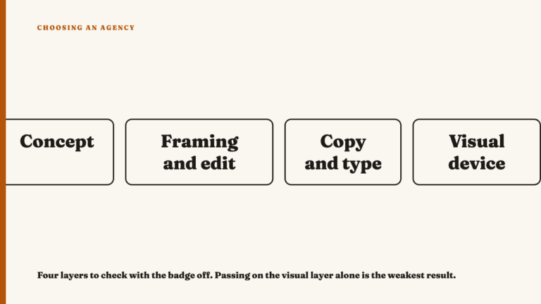
Give credit where it is earned first. An excellent carousel is not a low bar. It takes deliberate slide sequencing, where each slide sets up the next instead of adding another fact. It takes a hook slide that earns the swipe rather than restating the caption. It takes a visual system that holds steady across every slide, same grid, same type scale, same color logic, so the carousel reads as one designed object instead of images stapled together. And it takes an ending slide that does something other than repeat the first slide’s headline.
That level of craft proves someone understands pacing, visual hierarchy and read order well enough to execute under a swipe interface. Do not discount it because the rest of the account looks thinner. It tells you the account has at least one person genuinely good at this.
What the weaker formats look like, side by side
Put next to that carousel, the rest of the account tends to show a specific set of tells. A single image post leaning on a default template, the same border and logo lockup dropped onto a new photo with none of the compositional care the carousel’s slides get. A caption that reads like an afterthought, cropped hard at the caption box limit instead of written with shape. Short form video with no edit rhythm, one static clip with a caption overlay slapped on top, nothing suggesting anyone storyboarded it the way the carousel clearly was.
What is worth noticing is a Reel visibly rougher than the carousel three posts earlier on the same grid. The size of the gap is the signal, not the weak format alone.
Why this happens: how these teams are actually staffed
The usual mechanism is simple. One specialist, often a designer, is hands-on with the format they are strongest in, and that format becomes the account’s visible ceiling. Everything else gets produced by whoever else touches the account: a junior staffer, a generalist stretched across clients, or a template with minimal customization because nobody with design attention has time left. The carousel gets a craftsperson. The Reel gets whoever is available that week.
This differs from a brand deliberately under investing in a format. A brand that does not need Stories will usually post them rarely or not at all, absent by choice, not present but visibly rough. A staffing gap looks the opposite way: the weak format still shows up, just made with less care. Absent is a decision. Present but weak is usually a resourcing problem.
How to actually check for this in a portfolio review
- Find the account’s best visible format and treat it as the quality ceiling.
- Pull up every other format the account uses in the same recent window, not cherry picked examples, and hold each against that ceiling. Look at pacing, layout, caption care and edit rhythm, not just whether the post exists.
- Ask whether the weaker formats are absent or present but weak. A format the account barely touches is a strategic choice, not a red flag. A format posted regularly but consistently rushed next to the strong one is a different problem, judged differently.
Work with what you can already see
If this pattern shows up on an account you are looking at, it is worth raising directly rather than guessing. See this year’s selections to check how a range of formats holds up across a full account, and nominate an agency whose work holds up across formats, not just in one standout post.
What this pattern does and does not tell you
This pattern flags a risk, not a verdict. Seeing a strong carousel next to a weak Reel tells you where to ask a question. It does not tell you whether the specialist behind that carousel would leave with the account, whether the agency has noticed the gap, or whether the weaker formats matter for what you are trying to achieve. If your use case barely touches short form video, a rough Reel is close to irrelevant to your decision.
It also cannot answer whether this reflects the whole team or a single contractor. That question belongs in diligence, not a craft read of what is posted.
FAQ
If an agency’s carousels are excellent but everything else is average, is that still a good agency?
It means the agency has at least one genuinely strong capability, worth crediting on its own terms. It does not tell you the rest of the team or account is equally strong. Before treating the gap as disqualifying, check whether the weaker formats actually matter for what you need the agency to do.
How is this different from an agency just being inconsistent across different clients?
This is narrower. It is about one account, multiple formats, compared side by side in the same window. Whether an agency is uneven from one client to the next is a separate, broader question, and it is not what this pattern describes.
Sources
- What makes a carousel actually work, checked 2026-09-09
- What a portfolio leaves out, checked 2026-09-09
- Why one excellent campaign tells you almost nothing, checked 2026-09-09
- Whether an agency built a system or just one good post, checked 2026-09-09
- See this year’s selections, checked 2026-09-09
- Nominate an agency, checked 2026-09-09