The logo-off test: would you still know whose post this is?
You are scrolling an agency’s portfolio and every piece is fine, yet by the twelfth you cannot say what the first one was. Here is a way of looking that explains why.
The moment every piece looks fine and none of it sticks
A dozen pieces go past, each competent, and none leaves a trace by the time the next one loads. Competence is the price of entry. Identity is what lets a piece be recognised as itself, not as an example of its category.
Part of the reason is that the label does a lot of invisible work. The logo, the handle, the avatar and the brand colours tell you whose post it is before the work has to. When the badge is doing the identifying, the work underneath is excused from the job.
The test below is a way of looking, not a verdict. Not every client wants or needs a loud identity.
How to run it, literally and in your head
- Cover the corner logo and the handle with a thumb or a sticky note.
- Mute the sound if the voiceover names the brand, since a spoken name is a badge too.
- Desaturate the screen, or squint, to get past the brand colours and see shapes, framing and rhythm.
- Ask one question: if this appeared unlabelled in a stranger’s feed, what would tell them who made it, or only what category it belongs to?
- Do it on five or six pieces side by side, not one. Sameness only shows across several.
When you cannot cover anything, do it in your head. List what you would be left with if the badge, the avatar, the end card and the palette all vanished. Treat five or six as a viewing habit, not a statistical threshold.
What is left when the work has a voice
Every example below is invented, and each is spottable on screen.
A framing habit. Picture a food account that always shoots from slightly below the plate, so the dish looms like a building. Across six pieces the distance stays the same even when the subject does not.
A pacing signature. Perhaps a habit of holding a beat one second longer than expected, so the awkward silence becomes the joke. Or a punchline that always lands before the cutaway, never after.
A type voice. It is how headline text is written and set, not only the font. Compare sentence-case understatement, a calm line under a chaotic clip, with shouted caps on everything. Or captions that argue with the footage.
A recurring set or prop logic. Imagine every video happening beside the same broken vending machine, which reacts to whatever the client sells. That is a device, not a decoration, because it does comedic and structural work.
A first or final line. The test is whether a regular viewer could finish it for you. If the closing line always turns the product into a small apology, someone who has seen three will mouth the fourth.
What is left when the work was leaning on the label
Strip the badge from a clean product shot, a trending sound, a soft-focus lifestyle clip and a stat graphic, and you have four pieces that could carry any competitor’s logo with no edit. The tell is that the identity lived in the colour block and the logo sting, not in the idea or the execution. This is the territory of what everyone in the category already does.
Separate this from restraint. A quiet, plain approach chosen on purpose for a brand that should be plain is a decision. Plainness by default is the absence of one. Check the set: chosen plainness shows up as the same patient framing or dry caption register every time, while default plainness varies with nothing connecting it.
One warning. A distinctive filter or template can fake the first pass. That is where you need the second step, in the table and limits below.
A quick sorting table for what you just saw
Record the result by layer for each piece so the portfolio read stays comparable.
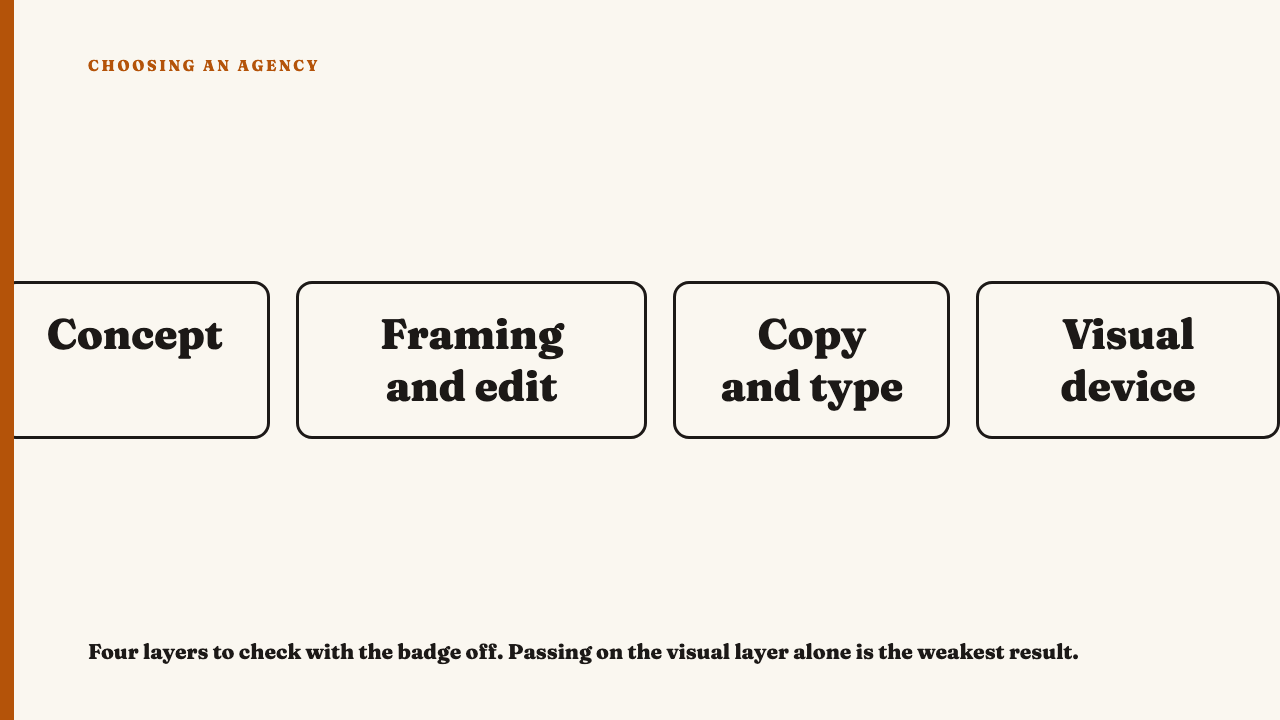
| Layer | Could identify with badge off | Could not | Best guess: voice, device, or just a look |
|---|---|---|---|
| Concept | |||
| Framing and edit | |||
| Copy and type | |||
| Visual device |
Most strong work will pass on at least two layers. Passing on the visual layer alone is the weakest result, because it is the easiest layer to borrow.
Where the test misleads you
You are testing the work, not the brand’s fame. If you already know the client’s house look, you may be recognising that and not the agency’s craft.
Ask whose identity you are seeing: the client’s guidelines or the agency’s own habits. An agency whose clients all share one device is showing its own hand. See when an agency’s different clients all look the same.
A heavily templated look can be recognisable and still be empty. Recognisable is not good. To check, read when a template is doing the thinking.
Finally, recognisability on a single piece can be luck. Repetition across the set is what separates a voice from a one-off. This post covers only the single-piece pass; the second question, whether an agency built a system or just one good post, has its own post.
Taking the result into a portfolio read
Phrase the finding precisely. “Framing habit present, copy voice absent, rest is category default” is more useful in your notes than “feels generic”.
Watch the pieces that failed and ask what the agency was solving for in them. Some failures belong to the brief, not the agency.
Then carry one question back to the portfolio: which of these would I still recognise next week with no badge on it?
If you want work to practise on, see this year’s selections. They are editorial selections, not a contest result. If you know an agency whose work would pass, you can nominate an agency.
FAQ
What is the logo-off test for social media work?
You cover or imagine away the logo, handle and brand colours, then ask what still marks the piece as one agency’s or one brand’s work. What remains is the work’s own identity, and what disappears was borrowed from the badge.
Does work have to be instantly recognisable to be good?
No. Quiet or deliberately plain work can be excellent, and the test separates chosen plainness from default plainness, not loud from quiet.