High Production Value Is Not the Same as Good Work
You are scrolling an agency’s portfolio and every piece looks expensive. The light is soft, the motion is eased, the audio is clean, and some of it still feels hollow. Here is a way to say why: judge the finish and the thinking as two separate things.
Why the expensive-looking piece wins the first look
That hollow feeling is information, not a mood. It can mean a finish has arrived without an idea, and you are noticing the gap.
The halo effect is a cognitive bias in which a positive impression in one area lifts your opinion of another. Nielsen Norman Group describes a close relative from interface design, the aesthetic-usability effect, the tendency to perceive attractive products as more usable even when they are not more effective. That finding is about interfaces, so we use it as a close parallel, not as proof about social posts. Processing fluency, the ease with which something is taken in, is listed among the influences on judgments of attractiveness and confidence. A clean finish is easy to take in, so it can lift your impression before the idea is examined.
The error runs both ways: the well-lit nothing is over-credited and the handheld something under-credited.
Polish is bought, craft is decided
Polish is what budget and vendor skill produce whatever the idea was: lighting, lens choice, colour grade, retouching, clean audio, eased motion graphics, a well-dressed set, a music swell. Look for a slow push-in on a product, shallow depth of field on b-roll, evenly lit skin, or a soft-focus lifestyle montage set to a rising track.
Craft is the set of decisions. What the post is about and what it leaves out. Which frame opens it. Which line carries it. Where it cuts. Why it belongs on this platform in this format.
Polish makes something look finished, and craft makes it worth finishing. A piece can have all of the first and none of the second, and the reverse. In explainer work, the bar is clarity, not spectacle.
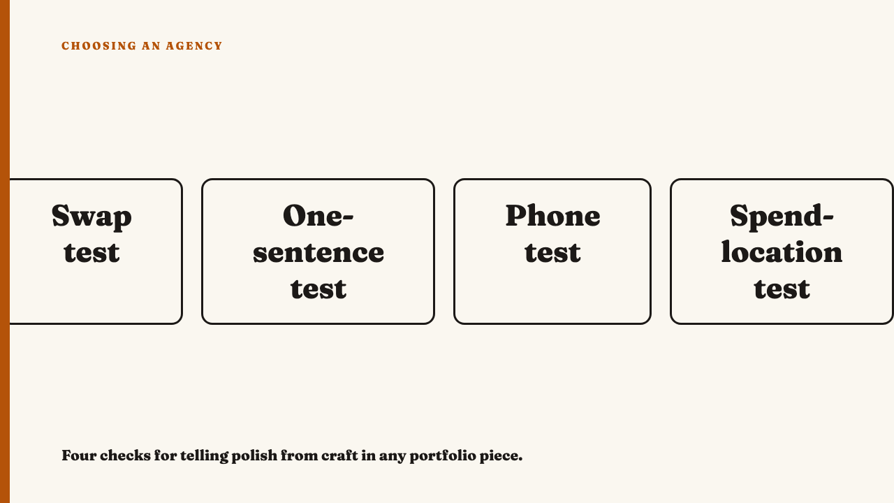
Four checks that pull the two apart
The one-sentence test below is the same skill as reading what strategy looks like when you can only see the output.
| Check | What you do | What a fail tells you |
|---|---|---|
| Swap test | Change the product or brand name. Does it still work unchanged? | Then nothing in it was specific to this client. That is a craft failure however good it looks. |
| One-sentence test | Say what it says in one plain sentence, with no adjectives about how it looks. | If the sentence is only “it feels premium” or “it’s aspirational”, the idea is missing. |
| Phone test | Picture it handheld on a phone, ungraded. What disappears? | Nothing meaningful lost means the polish was decoration. Total collapse means the polish was carrying the idea. |
| Spend-location test | Where did the effort go? | A costly set for a joke that needed one sentence is a mismatch. A free, unexpected first frame can be the evidence of thought. |
A well-lit nothing next to a rough something
This is an illustration built for this article, not a description of any real agency or brand. Both posts are invented, for an unnamed meal-kit subscription.
The first post is a slow-motion pour, warm grade, gold type reading a vague aspirational line, a swelling track. It has no claim and no point of view. Any logo could sit on it, so it fails the swap test, and its one sentence is “it feels premium”. On the phone test only the mood disappears, so the mood was all there was.
The second is a handheld phone clip of someone crossing out a line on a printed sheet. The caption says one specific, slightly awkward true thing: the promised prep time only holds once you have cooked the meal before. It cannot be swapped onto another category, its one sentence is easy to write, and the phone test costs it nothing.
The second post is not better because it is rough. It is better because a decision is visible in it. Roughness alone earns nothing.
The reverse mistake: marking down rough work that is sharp
The mistake has a sibling in why work can perform well and still be bad work: one visible signal should not decide the verdict.
Separate rough by choice from rough by neglect. Choice is consistent, fits the idea, and its flaws are the kind a person picked. Neglect shows as text unreadable at phone size, audio that drops out, framing that wanders for no reason, and captions clearly filled in to tick a box.
Legibility and audio problems are execution failures, not a “cheap look”, and they count against a piece even when the idea is good. Do not swing to admiring anything unpolished. A lack of budget often removes the option of polish and leaves only decisions, which makes the work easier to judge, not harder.
Holding the two apart across a whole portfolio
Use two passes. First, turn the sound off, ignore the finish on purpose, and note only what each piece is saying. Second, ask whether the finish serves that idea. Then find the least polished pieces and ask what the agency did there. The thinking has nowhere to hide.
If the finish is uniform but the ideas swing from sharp to empty, the polish is probably a house or vendor standard and is not evidence about the thinking. If the finish varies but the idea quality holds, the agency is deciding. For the most polish-heavy format, see judging a photography-led account, not just the photos.
Polish plus a real idea is the best case, and polish is not the enemy. The point is not to distrust a good-looking piece but to stop it from doing the judging for you.
Where to practise
See this year’s selections, and run the four checks on any piece. If you know a small team whose work rewards a closer look, nominate an agency.
FAQ
How can I tell whether an agency spent its budget on the idea or on the finish?
If the piece works unchanged for any brand, or the cost sits where the idea did not need it, the effort went to finish. That describes the piece, not what anyone actually spent.
Does a rough, phone-shot post mean the agency did less work?
Not necessarily. Rough by choice shows as consistency and fit to the idea. Rough by neglect shows as unreadable text and dropped audio.