What separates a considered quote card from a lazy one
You are three screens into an agency’s portfolio and you hit a quote card. Plain background, a short line, a name underneath. Your eye moves on before your brain does, because there is apparently nothing to look at. That reflex is the problem. The text card is the format most likely to be waved through in a review, and one of the easiest places to see whether anyone made a decision.
Why this format gets a pass it hasn’t earned
The assumption is in the reflex: anyone could make this. Type a sentence, pick a background, done. It is the same reasoning that makes a plain declarative sentence look easy to write, right up until you try to write one that lands.
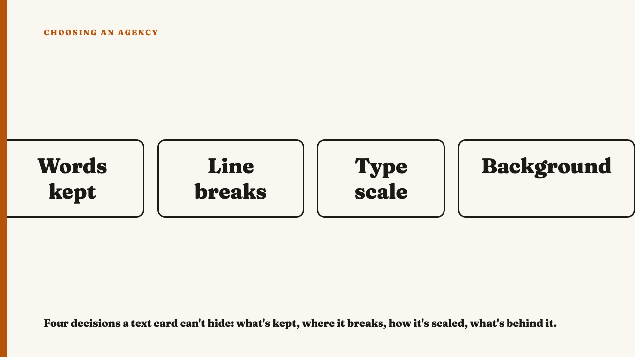
It is also backwards. Stripping away photography, motion and layout variety does not remove craft from the work, it removes the places craft can hide. A weak edit survives a fast cut video because the pace covers it. On a text card nothing covers anything. What is left is the words kept, where the line breaks, how the type is scaled, and how it sits against what is behind it. Four decisions, all visible at once. Failures do not get smaller in this format, they become the whole object.
What the words being cut reveal
Someone had a longer thought, in an interview or talk, and four or five words of it ended up on the card. Which four or five is the first thing to look at. A considered edit keeps the clause that carries the turn, and that clause is rarely the opening. It arrives after the setup, once the speaker stops announcing what they are about to say and says it. The edit finds it, cuts what came before, and drops qualifiers that only made sense with the paragraph attached. What is left reads as a complete thought out of context, slightly sharper than a person would say by accident.
The lazy version has two shapes: the opening sentence lifted whole, throat clearing intact, ending on a qualifier with nothing left to modify, or a truism that could sit under any photograph on any account. Both signal that nobody chose these words, they chose a length. That instinct separates a written caption from a filled-in one, applied to an even shorter surface.
Line breaks are not a formatting choice
A break decides where the reader pauses and which word lands hardest. An intentional one lands at a natural pause, usually a clause boundary, and ends the line on the word carrying the emphasis, so each line reads as its own unit. Read one aloud and the rhythm of your voice matches the shape on screen.
An unintentional break is just as visible. A word sits orphaned mid clause at the end of a line because a fixed width text box wrapped the type wherever it ran out of room, splitting a phrase that should have stayed together. The sentence was typed into a box and never looked at again as a sentence.
Type scale and hierarchy at thumbnail size
- Any size or weight difference between the line and the attribution? Quote and name set at identical size and weight is the clearest tell of an untouched template default. Any deliberate hand introduces a difference.
- Does the contrast hold when the image is small? Check it at feed size, not in a case study deck. Thin weights and low contrast pairings often look elegant large and dissolve into grey mush shrunk.
- Is the attribution its own element? A considered card gives it lower priority through size, weight, colour, or its own pocket of space. A rushed one crams the name into the same weight as the line it credits, so the eye cannot tell where the quote ends.
The background is doing work or it isn’t
A considered background has the contrast built in: a flat colour field chosen so the type reads without any rescue, or a photograph with enough dead space that the text lands somewhere quiet. Where an overlay is used, its density looks chosen for that image, dark enough to carry the type over the busy part of the frame, light enough that the photograph still reads.
The lazy version is a busy photo dropped behind the words with no adjustment, so the type crosses a high contrast edge and half of it disappears. The other is the gradient that shipped with a template, recognisable because it relates to nothing else in the brand.
Reading one card versus reading a grid of them
One card in isolation can look fine. The account view is where the format gives an agency up. Picture a professional services firm posting a quote card twice a week. Scroll the grid and you see one type family throughout, the quote set at one of two sizes depending on length, the attribution always in the same place relative to the line, the same margin every time. There is a rule underneath, and you can infer it after four of them.
Now the same cadence without the rule. One card centres the type, the next left aligns it. Margins tighten and loosen with no logic. One has a coloured accent bar, the rest do not. Individually each card is defensible, together they read as several people making one-off decisions in a hurry. It is the same read described in judging whether an agency built a system or just one good post, surfacing faster here because the format has so few variables to be inconsistent about.
Where to take this next
Read what a portfolio leaves out alongside this, since the cards an agency shows you are already a curated subset. If you know an agency whose text work holds up across the grid, you can nominate an agency for our selections.
FAQ
Isn’t a quote card just text on a background? How much craft can there really be?
Fewer visual variables does not mean less judgment on display, it means each remaining variable carries more of the decision. The words kept, the break, the scale relationship between line and attribution, and the contrast are the entire object, and a format with nowhere to hide shows taste more directly.
What’s the fastest tell that a quote card was made in under a minute?
A line break landing mid phrase because a fixed width text box forced the wrap. No size or weight difference between the quote and the attribution. A background that is an untouched template default. All three together means the card was assembled, not designed.
Sources
- What separates a written caption from a filled-in one, fetched 2026-09-06.
- Judging whether an agency built a system or just one good post, fetched 2026-09-06.
- What a social agency portfolio leaves out, fetched 2026-09-06.
- Nominate an agency, fetched 2026-09-06.