Judging Consistency Across Multi-Location Social Accounts
Scroll a franchise brand’s location accounts back to back and the story changes a few accounts in. Then the crops wander, the captions flatten, and near the bottom of the list an account posts a phone snap of a sign taped to a window. Same brand, same profile picture, different standard of work. The question is whether the agency behind that list is running one system, or handed out a template long ago and stopped looking.
One brand, many hands: why this is a different craft problem
On a single flagship account, consistency is mostly a design decision. One small team writes, shoots, edits and posts, so holding a look and a voice is a matter of taste, not coordination. Across a location list it becomes a management problem. Local managers or franchisees typically supply the raw material, a photo of the new staff member, a line about the Saturday event, and the agency’s real job is templating plus an edit pass on what comes in. You can see that pattern on any franchise list: no central team was present for those local specifics. So the question is not whether the agency can author a beautiful post. It is whether it built something that survives a dozen busy people, the same question as whether an agency built a system or just one good post, across many accounts at once.
What “consistent” is actually supposed to mean here
Consistent does not mean identical. A list where every post is one graphic with a different city name is a mail merge, not a system. A working system holds the frame steady and lets the content inside it change:
- A repeatable layout template: the same crop ratios, overlay typography in the same weights, sizes and positions on every account.
- One color grade pulling photos shot in different rooms under different lights toward the same family.
- A caption structure that repeats: a consistent opening move, a consistent sign off, a fixed place where the local detail goes.
- Matching logo placement and lockup, same corner, same size against the frame, same version of the mark.
- Evidence of a step between submission and publish: straightened horizons, cropped-out clutter, captions written by someone who writes for a living.
The counter-markers are as legible. Stock captions with a city name swapped in. Photos posted with the original phone crop and the yellow cast of overhead lighting. Content so generic it could belong to any location.
Where the drift actually shows up
Drift is rarely a cliff. It slopes down as the locations get smaller:
- Photo quality. The flagship gets shot properly. Three accounts down the images are darker, noisier, framed by whoever was standing there.
- Caption voice. Near the top captions read as edited. Further down, typos, loose capitalisation, sentences pasted between accounts with a location name changed.
- Stale assets. An older logo lockup, a profile photo from a previous refresh, a promotional graphic for something that ended two seasons ago, still live on some accounts.
- Posting frequency. Some locations stay active while others go quiet for long stretches, with nothing about the business to explain it.
- Uneven attention. One or two accounts get real ideas, a proper series, a format. The rest exist so the location has a page.
The excuse that’s actually true, and the one that isn’t
“We don’t control what local managers submit” is a real limitation. It holds up only when you can see the layer sitting on top of the submissions: recropping to the template, correction pulling different lighting conditions toward one grade, captions rewritten into the brand’s voice, unusable submissions rejected rather than posted.
If raw submissions are going up broadly as-is across most locations, that sentence is not describing a constraint. It describes an account nobody is running, wearing the same profile photo as the ones that are.
How to actually read the list, not just one account
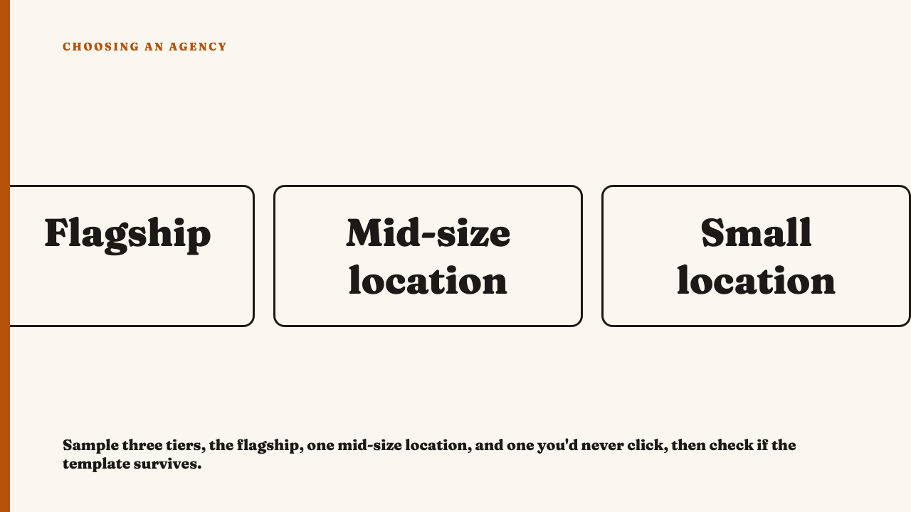
The flagship is the account you were meant to see, and usually the only one in the deck, the same blind spot as what a portfolio leaves out. So sample deliberately. Pick three from the location list: the flagship or largest, one mid-sized location, and one small location you would never have clicked. Put the three grids side by side.
Then check whether template discipline holds at tier three. Do the crop ratios match. Does the caption structure survive, opening move and sign off intact. Is the logo in the same place, and are photos corrected or just uploaded. If the template loosens as the locations get smaller, you have found the edge of the agency’s attention. One strong location account proves little on its own, the same reason one excellent campaign tells you almost nothing.
What it looks like when the system is working
The good version is recognisable in a minute of scrolling. Local photos have visibly been recropped and graded, so a picture from a bright corner room and one shot under fluorescent strip lighting belong together. Captions follow the same structural pattern everywhere, but the middle of each holds something only that location could say, a staff member by first name, a neighbourhood detail, rather than filler where the local specific should be. And the system permits a small flourish, a recurring in-joke at one location, a format that only works for a store with a patio, held inside the shared visual language rather than breaking it. Total uniformity and total absence of governance say the same thing, that nobody is deciding post by post.
Before you open another account list
For a sense of the standard when it holds, see this year’s selections. If you have watched an agency hold a system together across a hard roster, you can nominate an agency.
FAQ
Does the agency actually control what every location posts?
Usually not directly. Agencies set the system, the templates and the standard, while local franchisees or managers supply much of the raw photography and copy. The craft question is not whether the agency authored every post. It is whether a visible edit and curation pass sits between submission and publish, and that pass leaves marks in the crops, the grade and the captions.
Is some variation between locations normal, or is it always a red flag?
Minor variation is normal and often desirable. Welcome variation is a location’s own staff, events and neighbourhood showing through inside the shared system. Quality drift is different: production value falling off, the template loosening, captions losing their voice, editing effort thinning as the locations get smaller.