What an Agency Leaves Empty on a Slide Is a Craft Decision Too
You are looking at a quote card with a small logo and a lot of blank field around it, and you cannot tell if that emptiness is a considered choice or if nobody knew what else to put there. Both look like restraint at a glance. Only one of them is.
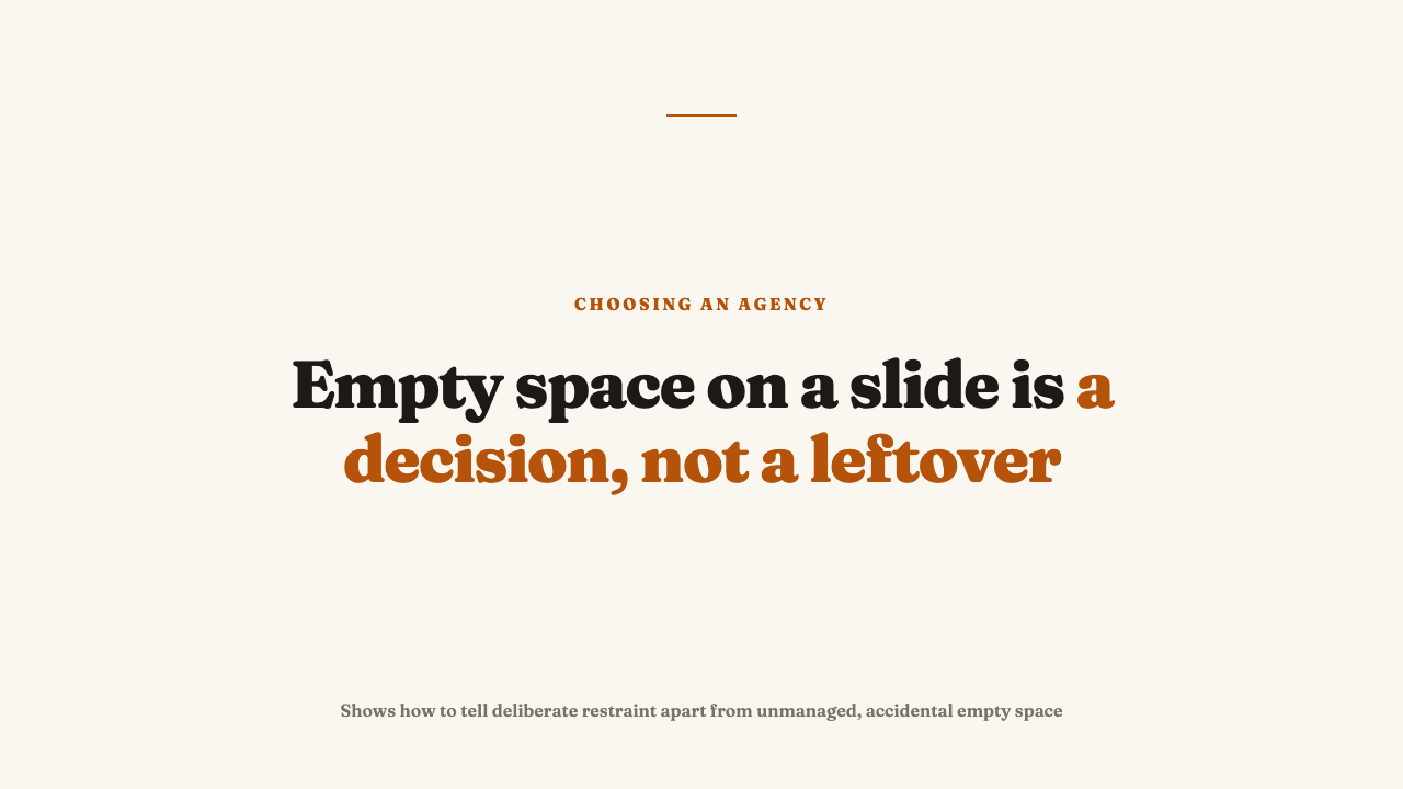
Empty space is not the absence of a decision
A blank area on a slide was either placed there on purpose or is what is left over when nobody decided what else the space should do. From a distance both read as “not much going on here.” Deliberate space has a job. It isolates the one thing that matters, slows the read down, which on a feed built for speed is itself a statement, and signals confidence, since only a claim that does not need decoration can survive being left alone.
Unmanaged emptiness does none of that work. Nothing on the slide was designed to be isolated, so there is no destination for the eye to arrive at. It is simply what remained after the logo and headline were placed. The two can occupy an identical share of the frame and still be opposite decisions, one earned and one accidental.
The two failure modes, and how to tell them apart
Poor space discipline shows up as one of two opposite habits. The first is compulsive filling, the discomfort with any area not carrying something. Every inch gets a job whether or not it needs one: a logo in one corner, a decorative icon in another, a gradient behind the type, a line of copy nobody will read wedged along the bottom. Look for competing focal points on one slide, decorative elements with no informational job, margins that shrink and grow from slide to slide, and text sized to fit the leftover space rather than because it matters.
The second is bare, unmanaged emptiness, space left over because nothing was designed to use it. The tell is a small, centered logotype adrift in a large flat field with no relationship to the frame’s edges, margins that do not match from side to side, and nothing else on the slide that has earned the emptiness around it.
What separates both from the version that works is a visible relationship between the elements and the space around them. Considered white space keeps its margins consistent, with a clear reason the eye lands where it does. Unmanaged emptiness has no such relationship. It is just what was left over.
What to check on the slide itself
- Margin consistency. Do the edges match on all four sides, and from slide to slide, or does the border wander with no rule.
- Hierarchy. Squint at the slide. Does exactly one element win your attention first, or are two or three fighting for it.
- Alignment. Do the empty and filled areas line up to an invisible grid, or do elements float at different distances from the frame depending on the slide.
- Repetition across the account. Does the same ratio of empty to filled space turn up post after post, which signals a system, or does it swing wildly, which signals none.
A worked comparison: the same message, two treatments
Picture a hypothetical quote card carrying one line from an interview. The cramped version puts the quote, a logo, a decorative icon, and a call to action strip all on one slide, none given room to breathe. Type is sized to fit whatever space is left, not because the line matters. There is no obvious place to look first, so the eye laps the slide before settling on the quote almost by elimination.
The considered version carries the same content. The quote sits alone with generous, consistent margins. The logo is small and sits at a fixed anchor point, the same position it occupies on every other slide in the set. Nothing else competes for attention. This version contains less, and reads faster, because there was never a question about where to look. It feels more confident too, since leaving space around a single claim is a bet that the claim does not need company to hold up.
Why this habit shows up across every static format an account makes
Comfort with emptiness, or the compulsion to fill it, is not a per-format style choice. It is an account-level habit visible on a quote card, a stat graphic, and a carousel cover slide alike. If an account is cramped on its quote cards, its stat graphics will likely show the same crowding, because this is a habit carried by whoever builds the templates, not an accident on any single post.
The inverse is worth noticing because it is rarer. An account confidently sparse on one format and chaotically dense on another is not showing range, it is showing that the formats were not designed by the same disciplined hand.
What this does and does not tell you
Clean, considered space is a necessary craft signal. It shows someone measured the margins and repeated the decision on purpose. It is not a sufficient one. A slide can have perfect margins and still say nothing worth reading.
The opposite error is just as easy to make. A busier, denser style is not automatically bad craft. Some brand voices are meant to feel loud. The tell is not the amount of density, it is whether the density is managed or simply accumulated: a clear hierarchy among the crowded elements repeated across the set, versus a crowd that differs in what it crowds from post to post.
See it applied to real work
This habit is one part of reading whether an agency built a system or just one good post, and it shows up most visibly slide to slide in what makes a carousel actually work. A single polished slide can also hide an account’s real day to day habits, part of what a portfolio leaves out. To see this reading applied to real accounts, see this year’s selections. If you know an agency whose static work holds up under this check, nominate an agency.
FAQ
Is a graphic with a lot of empty space automatically better designed than a busy one?
No. Density and sparseness are both legitimate styles. The craft question is whether the space, empty or full, was measured and repeated on purpose, not which style was chosen.
What is the fastest way to check if white space is intentional on a single slide?
Check margin consistency and hierarchy. Look at whether the empty border matches on all sides and across other slides in the account’s feed, and whether exactly one element wins the eye’s attention first when you squint.