Judging the Craft of a Screenshotted Testimonial or DM
Three posts into an agency’s feed, you hit a screenshot: a client message, a review, a DM saying the work changed everything. It is not a designed graphic, so you read it faster and believe it more. The object went through as many decisions as any art directed post, and made them invisible. Does it read as found, or as assembled to look found?
A screenshot borrows credibility from looking unedited
Every format makes an implicit promise about its origin. A quote card announces itself as made, and you factor its design in. A screenshot promises the opposite. I did not make this, I picked it up. Its credibility comes from an apparent absence of authorship.
Plenty of agencies honour that promise, but nothing stops someone presenting a built artifact as a recovered one. Because the guard is down, these choices deserve more scrutiny than an art directed post gets, not less.
What actually gets decided before a screenshot goes up
Between the message arriving and the post going up, someone makes choices. None are announced, and each changes how the post reads.
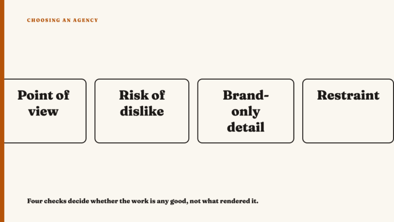
- What gets cropped out. Timestamps, the messages on either side, read receipts, other participants in a group thread. Removing context is a decision even when it is right.
- Whether identifying details are redacted, and how consistently. Blurring a name is normal. The question is whether the same blur appears on every post of this kind, or only where a name would raise questions about who is speaking.
- Whether the exchange survives or only the line does. A flattering sentence lifted out of the question that produced it is a different object than one sitting under its prompt.
- Whether the platform’s own interface is left intact. Native app chrome, the device frame, the status bar. Leaving those intact is one choice. Recreating them in a design tool so the bubbles sit where the layout wants is another.
The tells that a screenshot was assembled, not captured
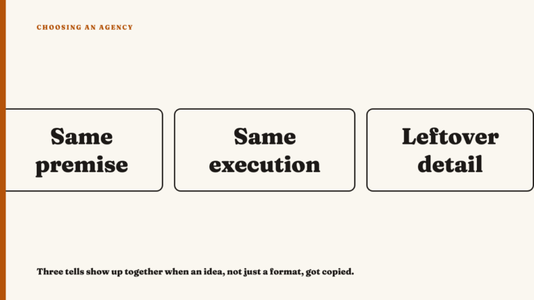
Picture a post presenting a raw client message. Interfaces vary type on purpose, so a bold name above a lighter timestamp proves nothing. The mismatch worth catching sits inside one element class: two message bodies in the same thread at different weights, body text whose spacing breaks the rhythm around it, letter spacing a fraction too even, pixel edges crisper than their neighbours.
Then there is the timestamp that fights its own story. A post framed as feedback from launch week, carrying a date three months earlier. Usually nobody faked it. They reused an old asset and forgot the date was legible.
The most common tell is framing that is too good. Real captures are slightly ugly. They carry a sliver of an adjacent window, a notification halfway through appearing, a stray cursor, an uneven margin where the crop landed. An image with perfect edges and even air on all four sides was composed, not captured. Watch the interface too: bubbles aligned in a way that platform does not align them, or a layout rebuilt from memory rather than photographed.
The tells that a screenshot is genuinely sourced
The honest version looks slightly worse, and that is the point. The crop sits a little off. A visible edge of something unrelated survives, part of a name in a sidebar. The redaction box is a rectangle someone drew quickly. The run up is included: the question that prompted the compliment, a bit of scheduling small talk, a sentence less quotable than the featured one. That is what showing you something looks like, rather than presenting an exhibit.
The interface should also match the current version of wherever it claims to be from. Icon placement, timestamp format, where the sender’s name sits. If you use the platform, check rather than assume.
One screenshot tells you little. A pattern across the account tells you more
Any single screenshot is easy to fake and equally easy to get right by accident. The unit of judgment is the account’s whole history with the format, because what is hard to fake is doing it the same honest way across dozens of posts.
Inconsistency is the signal. Redaction that appears only where a name would be awkward. Framing that is identically pristine every time, same margins, same bubble position, which no one capturing screens by hand produces. Or a format that was rough for months and suddenly arrived polished, which usually means the agency stopped screenshotting and started designing. This is the same method as reading strategy from public output, narrowed to one format.
What this reading does not tell you
A screenshot can pass every test here and still be weak proof. An honest capture of a real message can carry a testimonial that was solicited, or that came from the one delighted client out of many. That question is about the claim, not the craft. This piece assesses one thing: whether the object on screen reads as genuinely sourced or as staged.
It sits alongside the fact that an agency’s own account is weak evidence of its work, and the question of how much of that work the agency actually did. Cropping and curating are the same editorial act, so what a portfolio leaves out applies here too.
Where to take this next
To see this reading applied, see this year’s selections, editorial picks with the reasoning written out. If an agency’s work holds up under this scrutiny, you can nominate an agency.
FAQ
Does a screenshot have to be literally unedited to count as good craft?
No. Cropping is unavoidable. The tell is whether it is honest, leaving in the ordinary imperfection a real capture carries, or engineered to look rawer than the process was.
Is it dishonest for an agency to blur a name in a screenshot?
No. Redaction for privacy is normal. The craft question is consistency. A blur on every post of this type is a policy. A blur only where a name would undercut the pitch is doing something else.
Can a screenshot be well presented and still be weak proof?
Yes. Presentation and claim are separate tests. Passing the first says the object was really captured, not that the message inside reflects how the agency’s clients usually feel. That question sits outside this piece.
Sources
- What Strategy Looks Like When You Can Only See the Output, fetched 2026-09-07.
- An Agency’s Own Account Is Weak Evidence of Its Work, fetched 2026-09-07.
- How Much of That Work Did the Agency Actually Do?, fetched 2026-09-07.
- What a Social Agency Portfolio Leaves Out, fetched 2026-09-07.